Data Visualization Project-Development of Models Used in Computer Vision
Development of Models Used in Computer Vision
Jiacheng Xie, Haowen Ji, Dunhan Jiang
Oct-20th-2022
Introduction
As computational power and the amount of data accumulated during the past decade, deep learning models became the state-of-art approach in the field of computer vision in hope of improving visual task detection accuracy and reducing processing runtime. The development of deep learning models branched, and a lot of new models based on completely different architects arose. This paper thus investigates the adaptation and transformation of those mainstream models as an epitome of the development of the larger computer vision field. We confine our subject of interests to only GoogleNet, SeNet, VGG, AlexNet, LeNet, and ResNet. We download publication information of academic papers on these models from the Web of Science as a holistic dataset for this meta-analysis. This paper specifically focuses on the research area, citation number, citation relationship, research keywords, as well as publication geographical distribution properties as our guiding research questions.
To thoroughly investigate these topics and properly demonstrate the result, visualization techniques are of crucial significance to display paper’s attribution proportional wise, to capture the dynamic trends in citation amount temporal fluctuation, to unfold the messy and complex citation relationship between papers, to extract the constantly changing focus of ongoing research, and to map the regional publication distribution across the spatial dimension. With this knowledge visualized interactively, it would be much easier to understand the development of models used in the field of computer vision.
Method
We collect our data set from the Web of Science. Using the website’s search engine with filters that only return papers on our confined six mainstream models, we download publication information of these papers as excel sheets. This information includes article title, the name of journal, author(s), publication time, author’s attributed institution’s location, paper keywords and categories, application areas. Other information including paper’s citation list and reference list are obtained using a python script crawler. We use python code to build a pandas data frame to import the dataset. Since it contains a large amount of approximately 17,000 entries of holistic papers’ publication information, we can just eliminate those entries with missing values.
With the raw dataset cleaned, we group all papers into six groups based on their fields of models. We combine all citation list and reference list in our dataset to record all papers’ relationship. We do text extraction to find paper keywords and application areas. We also do data matching to find the paper author’s attributed institution’s location on the actual world map to generate the publication geographical distributional map. With the above analysis ready, we use python visualization tools to generate the below interactive figures. Specifically, visualization 1 and 2 use plotly while visualization 3, 5, and 6 use pyecharts. Visualization 4 uses PyVis and Networkx instead.
Results
Figure 1 aims to show the evolution of research area and keywords. It is a parallel categories graph connecting models, publication year, and research area. We make it interactively so that selecting any section gives it and its connected part a highlighted color. The number of papers in that section will also appear in the hint box. Each bar in this plot can be dragged to any position.
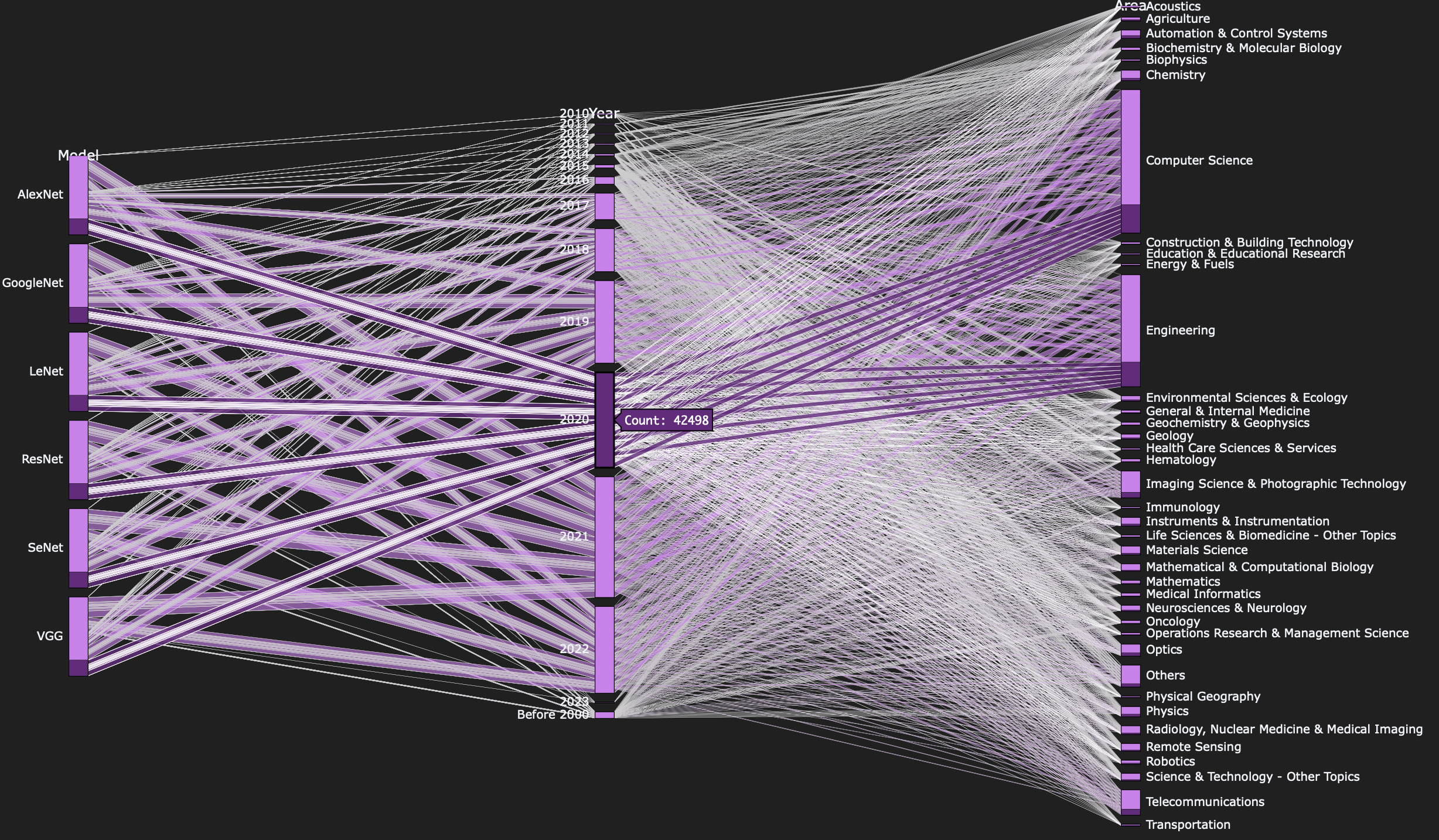
Figure 2 aims to demonstrate papers’ amount of citation over time. It’s a time river plot demonstrating the timelines of the citation number of selected published paper. One can choose a specific period at the bottom bar section to zoom into the graph and have a clearer view. Users can also filter models on the top right.
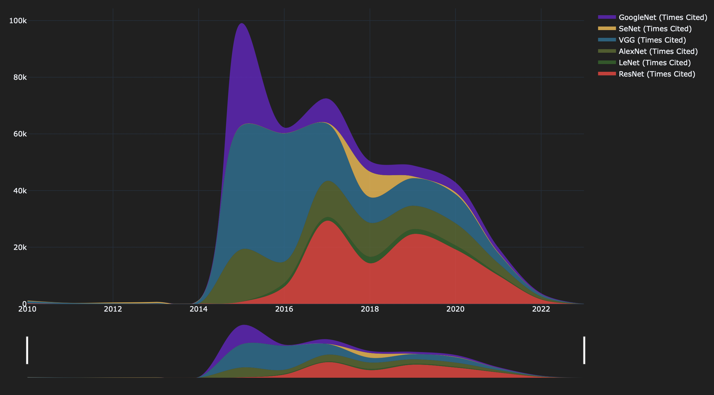
Figure 3 aims to show the citation relationship between papers. It’s a circular network graph. All papers are categorized into their own model's field and labeled with different colors on the top legend bar. On the circle there are nodes representing individual papers while edges in between represent citation relationship. The edge will have the same color with the source paper node. And the bigger the node, the larger its citation number. Users can hover the mouse over either edges or nodes for a highlighted view and more detail information of paper names and citation number. One can also zoom in and filter different models on top.
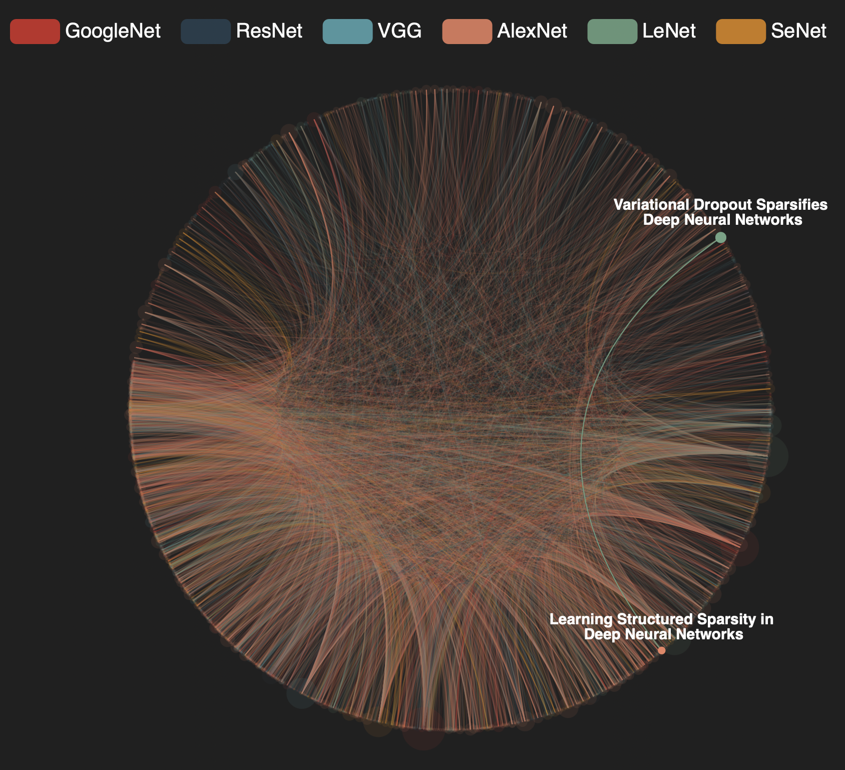
Figure 4 also aims to show the citation relationship between papers. It’s a linked network graph also with nodes representing papers and edges representing citation relationship. While it’s difficult to target a specific paper in the last circular network visualization, users can hereby filter paper(s) and edge(s) in the top rows by entering paper names and edge properties like citation number. Therefore, only part of the sophisticated network will be displayed. Users can also hover mouse over or click or drag the node to investigate the cite space interactively. The visualization is also dynamic and supports zoom in function.
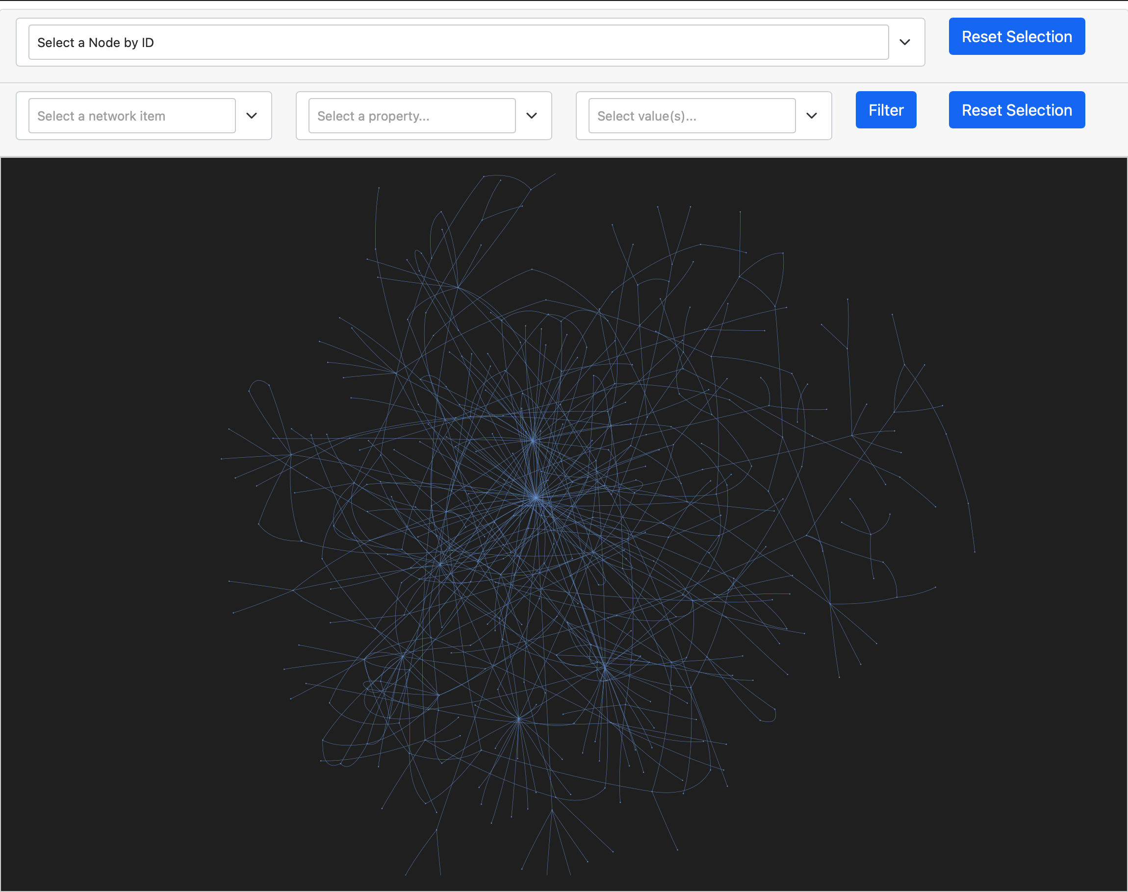
Figure 5 aims to capture the dynamic of changes in models’ application area. It’s a dynamic word cloud concatenating the most frequently appeared keywords of papers. Users can click start button for an automatic display. Alternatively, selecting different years in the timeline or filtering different models help users have a closer view at the keywords under distinct setting. Left corner buttons also enable users to select keywords with different occurrence frequency.
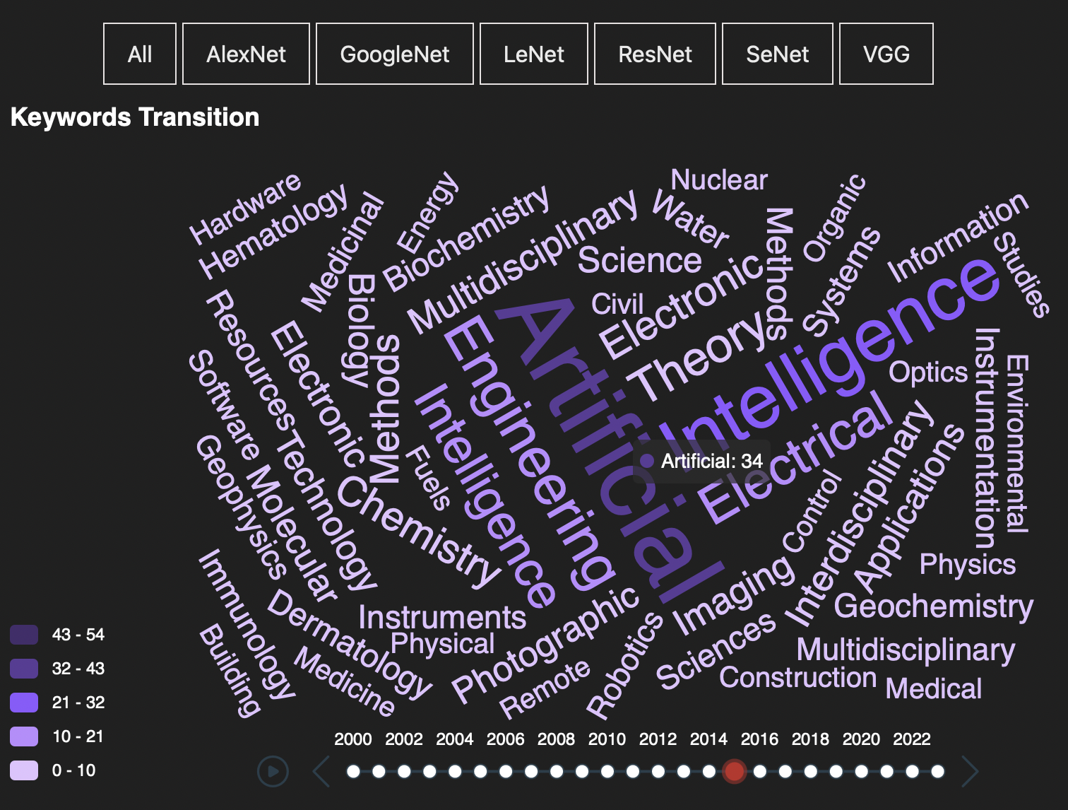
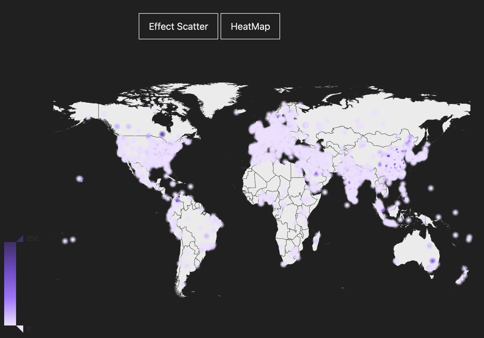
Figure 6 aims to map the regional publication distribution across the spatial dimension. It’s a geographical map view with colored nodes on top representing the number of publications at that location. Darker color means more publications and vice versa. Users can zoom in to see the publication distribution in each country and province. Publication number appears when the mouse hover over the node. The bar at the left bottom corner enables users to filter the number range. This map also provides a heatmap view with similar interactions.
Discussions
In figure 1, user tasks are to retrieve value and characterize distribution. It links three attributes of publication information effectively, with section proportion highlighted and paper number shown. Its interaction functions smoothly. However, too many connecting links make it a little bit messy to see. One solution is to let those non-highlighted links fade away for a more concentrated view.
In figure 2, user tasks are to sort and find extremum. Model filtering and zooming in interactions are helpful for efficiently capturing detailed citation changing trends. Since there are limited research going on before 2014, it should take another decade for us to picture a more nuanced development trend.
In figure 3, user tasks are to retrieve value and sort. Its model filters and mouse hover and click interactions make it efficient to see the citation relationship. The circular layout design also makes the cite space less messy. However, it’s literally impossible to find a specific target paper. Figure 4 solves this dilemma by adding a filter and selection function to effectively search for target papers with specific properties. Its user tasks are to find anomalies and retrieve value. But the network design is indeed messier than that in figure 3. These two figures compensate each other’s weakness and effectively demonstrate the citation space together.
In figure 5, user task is to retrieve value. Thanks to its automatic showcase and abundant filters, users can efficiently capture keywords of specific field at any given time. But the meaning behind the keyword cloud does need further interpretation.
In figure 6, user task is to characterize distribution. The color hue makes it efficient to compare the publication number. Potential room for improvement is papers’ location accuracy. Downloading a more accurate map with city and town names really help.
Conclusions
This paper gives an efficient solution to understand the research area, citation number, citation and reference relationship, research keywords, as well as publication geographical distribution of papers in the field of computer vision. These knowledge help people better and easier understand the structure and developmental trends of this field intuitively. Specifically, scholars may want to focus on popular keywords of latest publications from our keyword cloud. Researchers may also want to find the most influential foundational papers by the cite-space-visualization. Furthermore, our highly interactive online dash version also helps spread and popularize such knowledge to people new or outside to computer vision.
In the future, we can link all figures on one map to generate a well-rounded and even more interactive view of the current results. We can also incorporate more papers from other sub-areas of computer vision to conduct similar visualizations and combine with these existing works to generate a more holistic updated version.