Data Analytics and Visualizations
Intro to Data Analytics and Visualizations
What’s data visualization?
Visual representations of datasets
What’s information visualization (infovis/infographics)?
Finding the artificial memory that best supports our natural means of perception
What’s illustration
A visual representation (a picture or diagram) that is used to make some subject more pleasing or easier to understand
Illustration or Visualization?
Visualization is about MAPPING.
Why using Visualization?
- Visual Aids for Thinking
- Calculation on paper
- Visualization for Problem-solving
- Overlapping maps to find pattern
- Visualization for Eliciting Knowledge from Data
- Find data correlations
- Visualization for Clarification
- London subway map
- Visualization for Telling a Story
Two Key Aspects of Information visualization
- Representation
- Interaction
Week 1 Reading Post
Q1. What factors should you consider when develop a visualization?
- Consider resource limitations:computational capacity, human perceptual and cognitive capacity, and display capacity.
- Consider why the user needs it, what data is shown, and how the idiom is designed.
- Consider whether the vis is a stepping stone or for long-term use.
- Consider what external representations to use
- Consider the task of the vis users
- Consider the effectiveness of vis
- Consider multiple alternatives
- Consider how to validate the vis
Q2. Choose one type of complex vis idioms from below list and find one example (attach the picture): tree maps, network, link-node, parallel coordinates, star plot, fields, geometry maps, etc.. Discuss its visualization task, interactions, and efficiency.

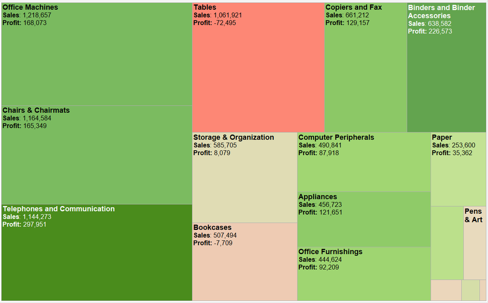
From: https://images.squarespace-cdn.com/content/v1/55b6a6dce4b089e11621d3ed/1528204277811-JX4HT3U2578DXA5CIW7O/Treemap-with-measure-name-labels.png?format=1000w
Treemap is the visualizations for hierarchical data. It is used to query attributes at leaf nodes. It shows hierarchical structure with containment rather than connection. All of the children of a tree node are enclosed within the area allocated that node, creating a nested layout. The size of the nodes is mapped to some attribute of the node. Treemaps are very effective for spotting the outliers of very large attribute values, but it shows no parent–child node relationships.
What’s Vis, and Why Do It?
Definition of visualization
Computer-based visualization systems provide visual representations of datasets designed to help people carry out tasks more effectively.
Visualization is suitable when there is a need to augment human capabilities rather than replace people with computational decision-making methods.
Why Have a Human in the Loop?
Vis allows people to analyze data when they don’t know exactly what questions they need to ask in advance.
Vis systems are appropriate for use when your goal is to augment human capabilities, rather than completely replace the human in the loop.
Why Have a Computer in the Loop?
By enlisting computation, you can build tools that allow people to explore or present large datasets that would be completely infeasible to draw by hand, thus opening up the possibility of seeing how datasets change over time.
Why Use an External Representation?
External representations augment human capacity by allowing us to surpass the limitations of our own internal cognition and memory.
External representations (external memory): carefully designed images
- Diagrams: information can be organized by spatial location, offering the possibility of accelerating both search and recognition
Why Depend on Vision?
Visualization is based on exploiting the human visual system as a means of communication.
The visual system provides a very high-bandwidth channel to our brains.
Why Show the Data in Detail?
Vis tools help people in situations where seeing the dataset structure in detail is better than seeing only a brief summary of it, since a single summary is often an oversimplification that hides the true structure of the dataset.
- when exploring the data to find patterns
- when assessing the validity of a statistical model
Why Use Interactivity?
When datasets are large enough, the limitations of both people and displays preclude just showing everything at once; interaction where user actions cause the view to change is the way forward.
A single static view can show only one aspect of a dataset.
Why Is the Vis Idiom Design Space Huge?
A vis idiom is a distinct approach to creating and manipulating visual representations.
A more complicated idiom can link together multiple simple charts through interaction.
Why Focus on Tasks?
The task of the users is an equally important constraint for a vis designer as the kind of data that the users have.
For discovery, vis can be used to generate new hypotheses, as when exploring a completely unfamil- iar dataset, or to confirm existing hypotheses about some dataset that is already partially understood.
Why Focus on Effectiveness?
The focus on effectiveness is a corollary of defining vis to have the goal of supporting user tasks, which means we need to concern about correctness, accuracy, and truth playing.
No picture can communicate the truth, the whole truth, and nothing but the truth.
Any depiction of data is an abstraction where choices are made about which aspects to emphasize.
Why Are Most Designs Ineffective?
The most fundamental reason that vis design is a difficult enter- prise is that the vast majority of the possibilities in the design space will be ineffective for any specific usage context.
In addressing design problems, we should consider “satisfy”, to find one of the many possible good solutions rather than one of the even larger number of bad ones.
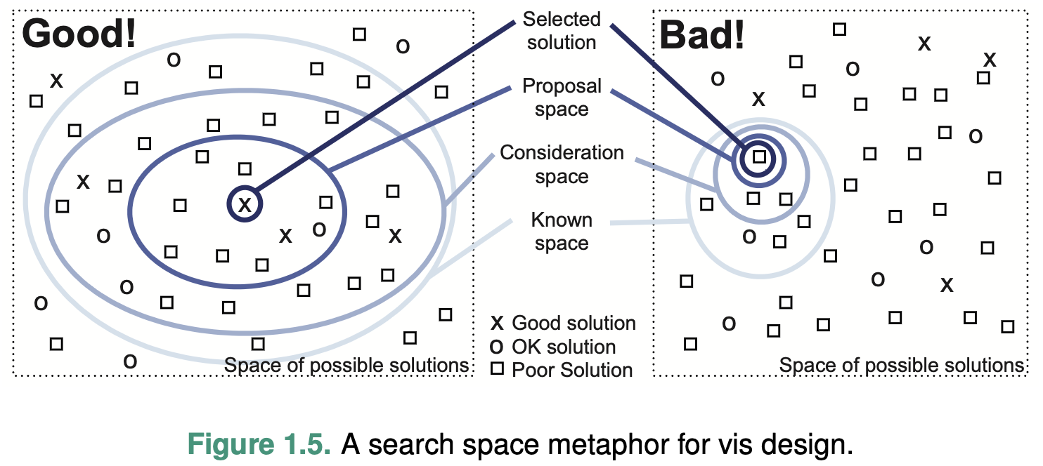
A fundamental principle of design is to consider multiple alternatives and then choose the best, rather than to immediately fixate on one solution without considering any alternatives, that is, explicitly generate multiple ideas in parallel.
Why Is Validation Difficult?
Because there are so many questions that you could ask when considering whether a vis tool has met your design goals.
Why Are There Resource Limitations?
You must consider at least three different kinds of limitations: computational capacity, human perceptual and cognitive capacity, and display capacity.
Scalability
designing systems to handle large amounts of data gracefully
Change blindness
The phenomenon where even very large changes are not noticed if we are attending to something else in our view
Information density (Graphic density / data-ink ratio)
A measure of the amount of information encoded versus the amount of unused space of a single image.
Trade-off: the benefits of showing as much as possible at once vs the costs of showing too much at once
Why Analyze?
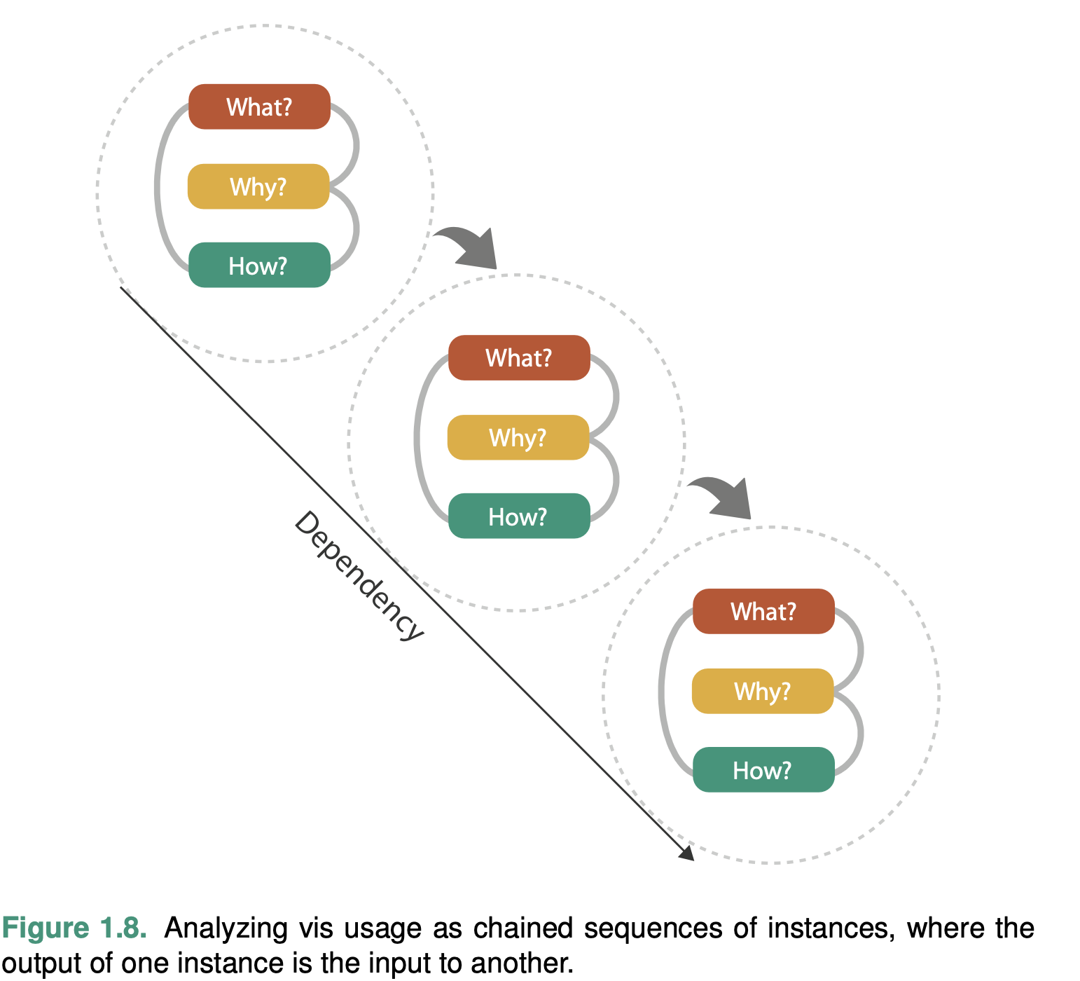
What data the user sees, why the user intends to use a vis tool, and how the visual encoding and in- teraction idioms are constructed in terms of design choices.
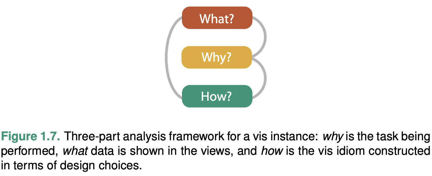
One of these analysis trios is called an instance.
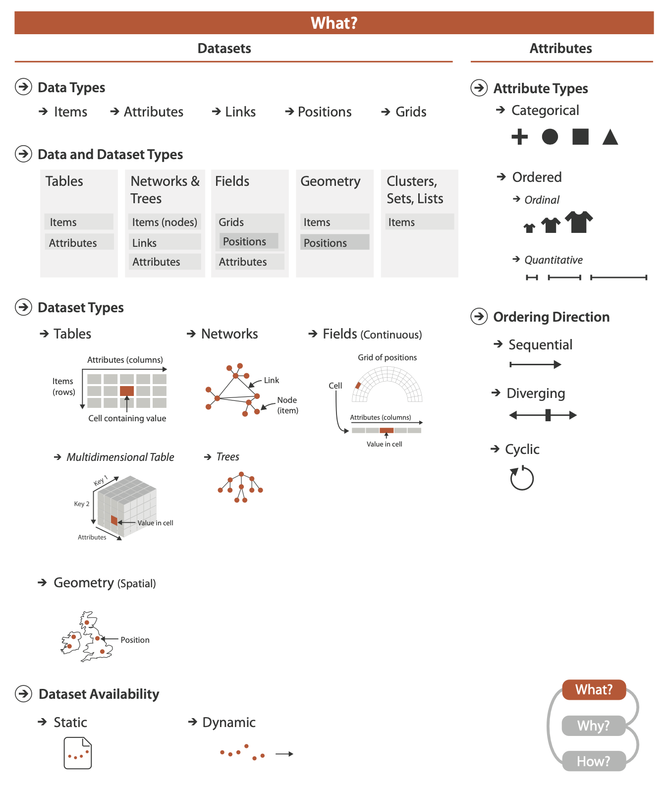
What: Data Abstraction
Why Do Data Semantics and Types Matter?
To move beyond guesses, you need to know two crosscutting pieces of information about these terms: their semantics and their types.
Semantics
The semantics of the data is its real-world meaning
Type
The type of the data is its structural or mathematical interpretation.
Data Types

Attributes (variable / data dimension)
An attribute is some specific property that can be measured, observed, or logged.
EG. salary, price, number of sales.
Item
An item is an individual entity that is discrete.
EG. a row in a simple table or a node in a network
Link
A link is a relationship between items, typ- ically within a network.
Grid
A grid specifies the strategy for sampling continuous data in terms of both geometric and topological relationships between its cells.
Position
A position is spatial data, providing a location in two-dimensional (2D) or three-dimensional (3D) space.
EG. a latitude–longitude pair
Dataset Types
A dataset is any collection of information that is the target of anal- ysis.
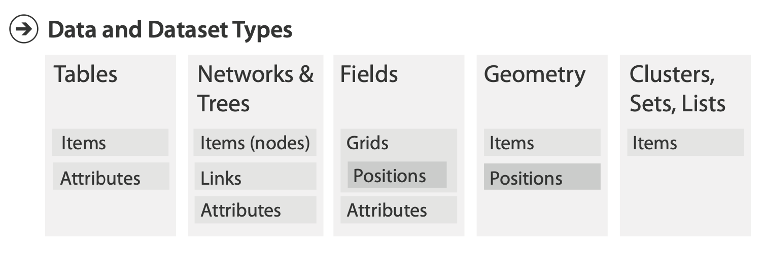
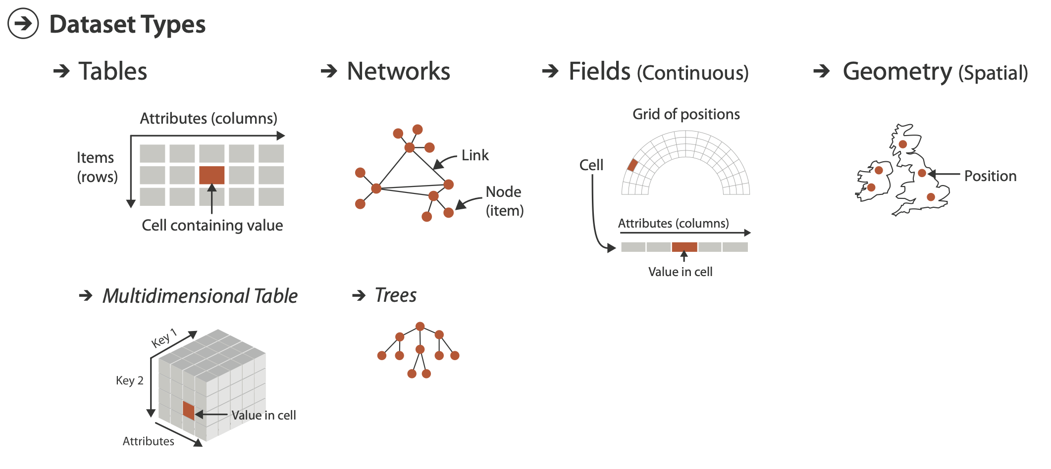
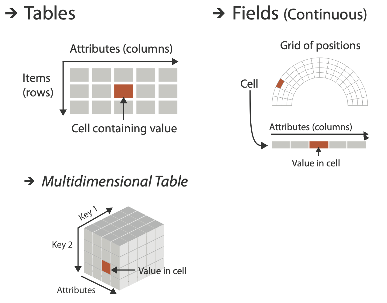
Tables
Tables have cells indexed by items and attributes, for either the simple flat case or the more complex multidimensional case.
Flat table
Each row represents an item of data.
Each column is an attribute of the dataset.
Each cell in the table is fully specified by the combination of a row and a column—an item and an attribute—and contains a value for that pair.
Multidimensional table
A multidimensional table has a more complex structure for in- dexing into a cell, with multiple keys.
Networks and Trees
In a network, items are usually called nodes, and they are connected with links; a special case of networks is trees.
Networks
Networks is well suited for specifying that there is some kind of relationship between two or more items.
An item in a network is often called a node. (vertex)
A link is a relation between two items.(edge)
Network nodes can have associated attributes
The links themselves could also be considered to have attributes associated with them; these may be partly or wholly disjoint from the node attributes.
Trees
Networks with hierarchical structure are more specifically called trees.
Trees do not have cycles: each child node has only one parent node pointing to it
Fields
Continuous fields have grids based on spatial positions where cells contain attributes.
Each cell in a field contains measurements or calculations from a continuous domain
Continuous data requires careful treatment that takes into ac- count the mathematical questions of sampling, how frequently to take the measurements, and interpolation, how to show values in between the sampled points in a way that does not mislead.
Spatial Fields
Continuous data is often found in the form of a spatial field, where the cell structure of the field is based on sampling at spatial po- sitions.
A central concern in infovis is determining whether the chosen idiom is suitable for the combination of data and task, leading to the use of methods from human–computer interaction and design.
Grid Types
When a field contains data created by sampling at completely reg- ular intervals, the cells form a uniform grid.
A rectilinear grid supports nonuniform sampling, allowing efficient storage of information that has high complexity in some areas and low complexity in others, at the cost of storing some information about the geometric location of each each row.
A structured grid allows curvilinear shapes, where the geometric location of each cell needs to be specified.
Unstructured grids provide complete flexibility, but the topological information about how the cells connect to each other must be stored explicitly in addition to their spatial positions.
Geometry
The geometry dataset type specifies information about the shape of items with explicit spatial positions.
The items could be points, or one-dimensional lines or curves, or 2D surfaces or regions, or 3D volumes.
Spatial data often includes hierarchical structure at multiple scales.
Geometry datasets do not necessarily have attributes, in con- trast to the other three basic dataset types.
Geometric data is sometimes shown alone, particularly when shape understanding is the primary task.
Other Combinations
A set is simply an unordered group of items.
A group of items with a specified ordering could be called a list.
A cluster is a grouping based on attribute similarity, where items within a cluster are more similar to each other than to ones in another cluster.
A path through a network is an ordered set of seg- ments formed by links connecting nodes.
A compound network is a network with an associated tree: all of the nodes in the network are the leaves of the tree, and interior nodes in the tree provide a hierarchical structure for the nodes that is different from network links between them.
Dataset Availability
The default approach to vis assumes that the entire dataset is available all at once, as a static file.
Some datasets are instead dynamic streams, where the dataset information trickles in over the course of the vis session.
Attribute Types
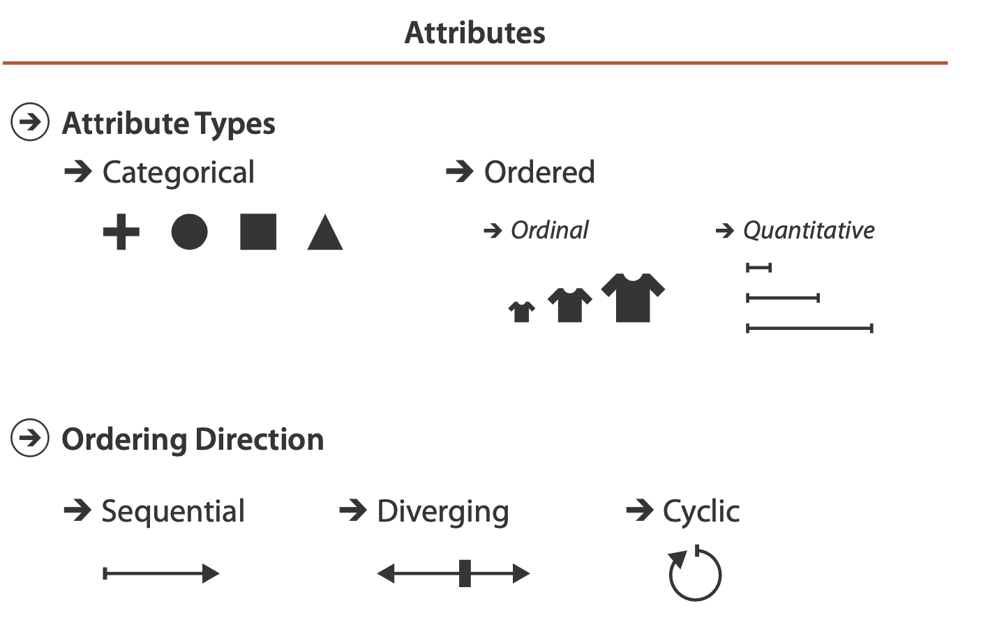
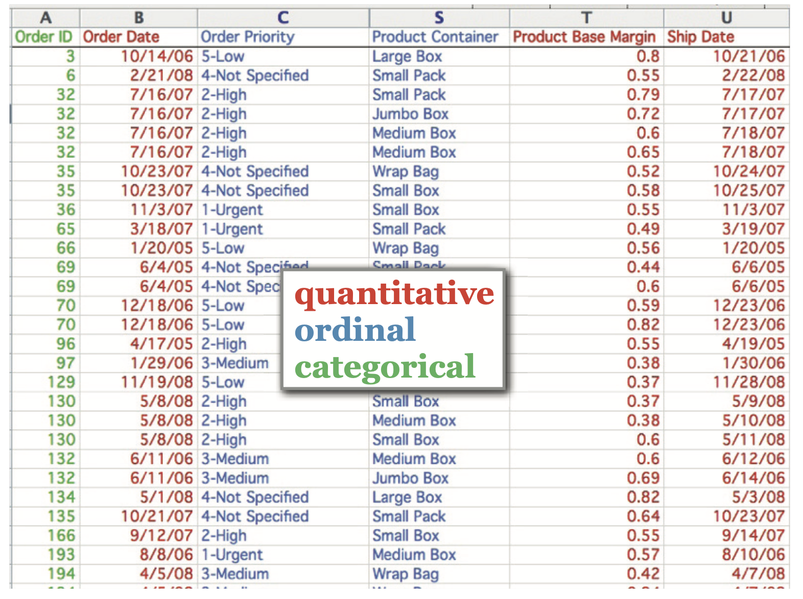
Categorical (Nominal)
The type of categorical data does not have an implicit ordering, but it often has hierarchical structure.
Categories can only distinguish whether two things are the same (apples) or different (apples versus oranges).
Ordered: Ordinal and Quantitative
All ordered data does have an implicit ordering
Ordinal data
With ordinal data, we cannot do full-fledged arith- metic, but there is a well-defined ordering
Quantitative data
A measurement of magnitude that supports arithmetic comparison.
Both integers and real numbers are quantitative data.
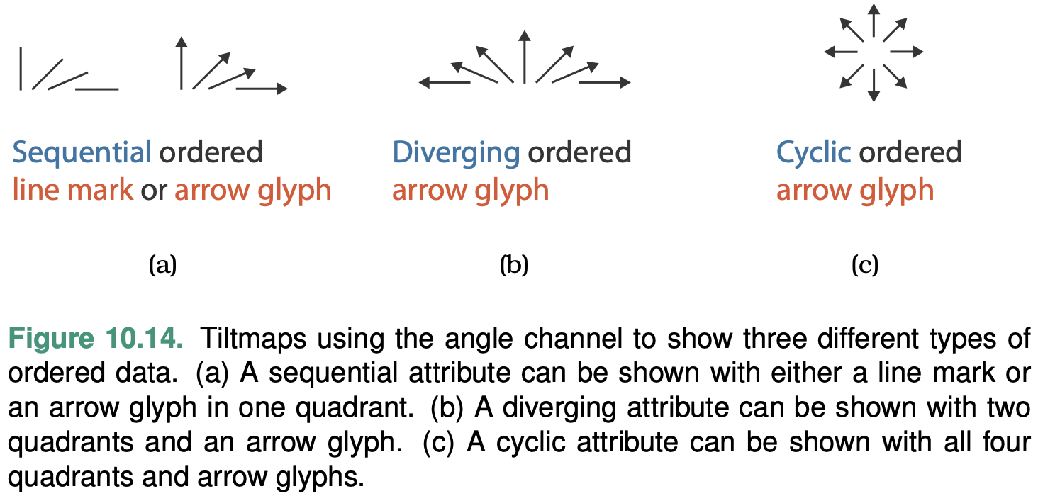
Sequential versus Diverging
Ordered data can be either sequential, where there is a homoge- neous range from a minimum to a maximum value (height), or diverging, which can be deconstructed into two sequences pointing in oppo- site directions that meet at a common zero point (A full elevation dataset).
Cyclic
The values wrap around back to a starting point rather than continuing to increase indefinitely (the hour of the day, the day of the week, and the month of the year).
Hierarchical Attributes
There may be hierarchical structure within an attribute or between multiple attributes.
For example, the geographic attribute of a postal code can be aggregated up to the level of cities or states or entire countries.
Semantics
Key versus Value Semantics
A key (independent attribute) attribute acts as an index that is used to look up value (dependent attribute) attributes.
Flat Tables
A simple flat table has only one key, where each item corresponds to a row in the table, and any number of value attributes.
In this case, there must not be any duplicate values within that attribute.
In tables, keys may be categorical or ordinal attributes.
Multidimensional Tables
A multidimensional table, where multiple keys are required to look up an item.
The combination of all keys must be unique for each item, even though an individual key attribute may contain duplicates.
Fields
Fields represent continuous rather than discrete data, keys and values are still central concerns.
Fields are structured by sampling in a systematic way so that each grid cell is spanned by a unique range from a continuous domain.
In spatial fields, spatial position acts as a quantitative key.
The crucial difference between fields and tables is that useful answers for attribute values are returned for locations throughout the sampled range, not just the exact points where data was recorded.
Fields are typically characterized in terms of the number of keys versus values.
The standard classification according to multivariate structure is that a scalar field has one attribute per cell, a vector field has two or more attributes per cell, and a tensor field has many attributes per cell.
Scalar Fields
A scalar field is univariate, with a single value attribute at each point in space.
The geometric intuition is that each point in a scalar field has a single value.
Vector Fields
A vector field is multivariate, with a list of multiple attribute values at each point.
EG. a 3D vector field is the velocity of air in the room at a specific time point, where there is a direction and speed for each item.
Tensor Fields
A tensor field has an array of attributes at each point, representing a more complex multivariate mathematical structure than the list of numbers in a vector.
Temporal Semantics
A temporal attribute is simply any kind of information that relates to time.
The time hierarchy is deeply multiscale: the scale of interest could range anywhere from nanoseconds to hours to decades to millennia.
One important idea is that even though the dataset semantics involves change over time, there are many approaches to visually encoding that data—and only one of them is to show it changing over time in the form of an animation.
Temporal attributes can have either value or key semantics.
A temporal key attribute is usually considered to have a quantitative type, although it’s possible to consider it as ordinal data if the duration between events is not interesting.
Time-Varying Data
A dataset has time-varying semantics when time is one of the key attributes, as opposed to when the temporal attribute is a value rather than a key.
A common case of temporal data occurs in a time-series dataset, namely, an ordered sequence of time–value pairs. These datasets are a special case of tables, where time is the key.
Week 2 Reading Post
Read Munzner 2014 Chapter 3. Write Short Answers to Below Questions (2-3 sentences per question), and reply to at least one other person's post.
Q1. Find one visualization example (you can use the ones posted in week 1 forum) and analyze its user tasks.
Q2. Briefly discuss one of the three work (ChartSeer, MoocVideo, NBSearch) Dr. Zhao shared in his guest lecture:
- what is this work about?
- how did the authors achieve their visualization goals/tool?
- why is this topic/visualization tool important?
References to Dr. Zhao's papers:
Zhao, J., Fan, M., & Feng, M. (2020). Chartseer: Interactive steering exploratory visual analysis with machine intelligence. IEEE Transactions on Visualization and Computer Graphics.
Zhao, J., Bhatt, C., Cooper, M., & Shamma, D. A. (2018, April). Flexible learning with semantic visual exploration and sequence-based recommendation of MOOC videos. In Proceedings of the 2018 CHI Conference on Human Factors in Computing Systems (pp. 1-13).
Li, X., Wang, Y., Wang, H., Wang, Y., & Zhao, J. (2021, May). NBSearch: Semantic Search and Visual Exploration of Computational Notebooks. In Proceedings of the 2021 CHI Conference on Human Factors in Computing Systems (pp. 1-14).
Q1

From: https://images.squarespace-cdn.com/content/v1/55b6a6dce4b089e11621d3ed/1528204277811-JX4HT3U2578DXA5CIW7O/Treemap-with-measure-name-labels.png?format=1000w
The main user task of this chart is to consume, more specifically, to present. This chart displays the sales and profit data of products of a company in a treemap to the user. The area of the treemap blocks represents the sales of a product, where a product with higher sales occupies a larger area. The treemap block's color represents a product's profits, where a more positive profit is represented by darker green and a more negative profit is represented by darker red.
Q2.
Chartseer
What:
Help people create charts with a machine learning engine by providing dynamic chart summarization views and chart recommendation views.
How:
This tool is embedded with GVAE(grammar variational autoencoder) that has the DNN (Deep Neural Network) encoder to encode charts into vectors and the DNN decoder to decode vectors into charts. The chart summarization function is based on the DNN encoder, while the chart recommendation function is based on the DNN decoder.
Why:
This tool is proposed to solve the challenges of conducting exploratory visual analysis (EVA). During EVA, analysts often get lost in the vast combinations of data variables and fail to conduct their analysis from a holistic view when they are making decisions on which subsequent activities to perform.
MOOCex
What:
MOOCex is a visual recommender system that recommends MOOC courses. Taking video lecture contents and course syllabus into consideration, MOOCex provides recommendations of lecture videos across different courses and presents an interactive visual semantic map of the recommendations to the learners.
How:
This tool consists of two main parts: recommendation engine and visualization generation. For the recommendation engine part, based on the content-based recommendation, the author improved the recommendation system using a sequence-based re-ranking model that ranks topic similarity, global sequence score, and local sequence score. This recommendation system is trained on over 4000 videos. For generating a visualization of recommendation results, techniques like multidimensional scaling, hierarchical clustering, and keyword extraction are used to generate a semantic map for the users.
Why:
Massive Open Online Course (MOOC) platforms are getting popular, but their course curriculum is limited since those courses are predefined and prerecorded. Also, most MOOC platforms use content-based recommendations to provide a ranked list for recommendations, which prevents learners from exploring learning content and making video playback decisions. Thus, MOOCex is introduced to help learners.
NBSearch
What:
NBSearch is a code search engine designed for Jupyter notebooks that supports natural language queries and interactive visual search results.
How:
The author trains machine learning models to interpret semantic code search queries to code descriptors. The models are trained with commented Jupyter notebook cells to understand natural languages. Then, to help the user explore the query result, an interactive search result panel is designed to display a ranked list of relevant cells.
Why:
Code search is important for developers. However, for a developer using computational notebooks, code search is limited due to the flexible nature of the notebooks. For example, notebooks are often composed of loosely-connected cells, meaning that code in those cells is both independent and interrelated, which poses a great challenge to semantic code search. Also, a novel search result interface rather than simply listing the results is needed because of the complex relationship among notebook cells.
Why: Task Abstraction
Why Analyze Tasks Abstractly?
Transforming task descriptions from domain-specific language into abstract form allows you to reason about similarities and differences between them.
The task abstraction can and should guide the data abstraction.
Who: Designer or User
Vis tools fall somewhere along a continuum from specific to general.
Specialized vis tools are designed for specific contexts with a narrow range of data configurations, especially those created through a problem-driven process.
General vis tools are designed to handle a wide range of data in a flexible way.
Actions
Hight-level: analyze
Mid-level: search
Low-level: query
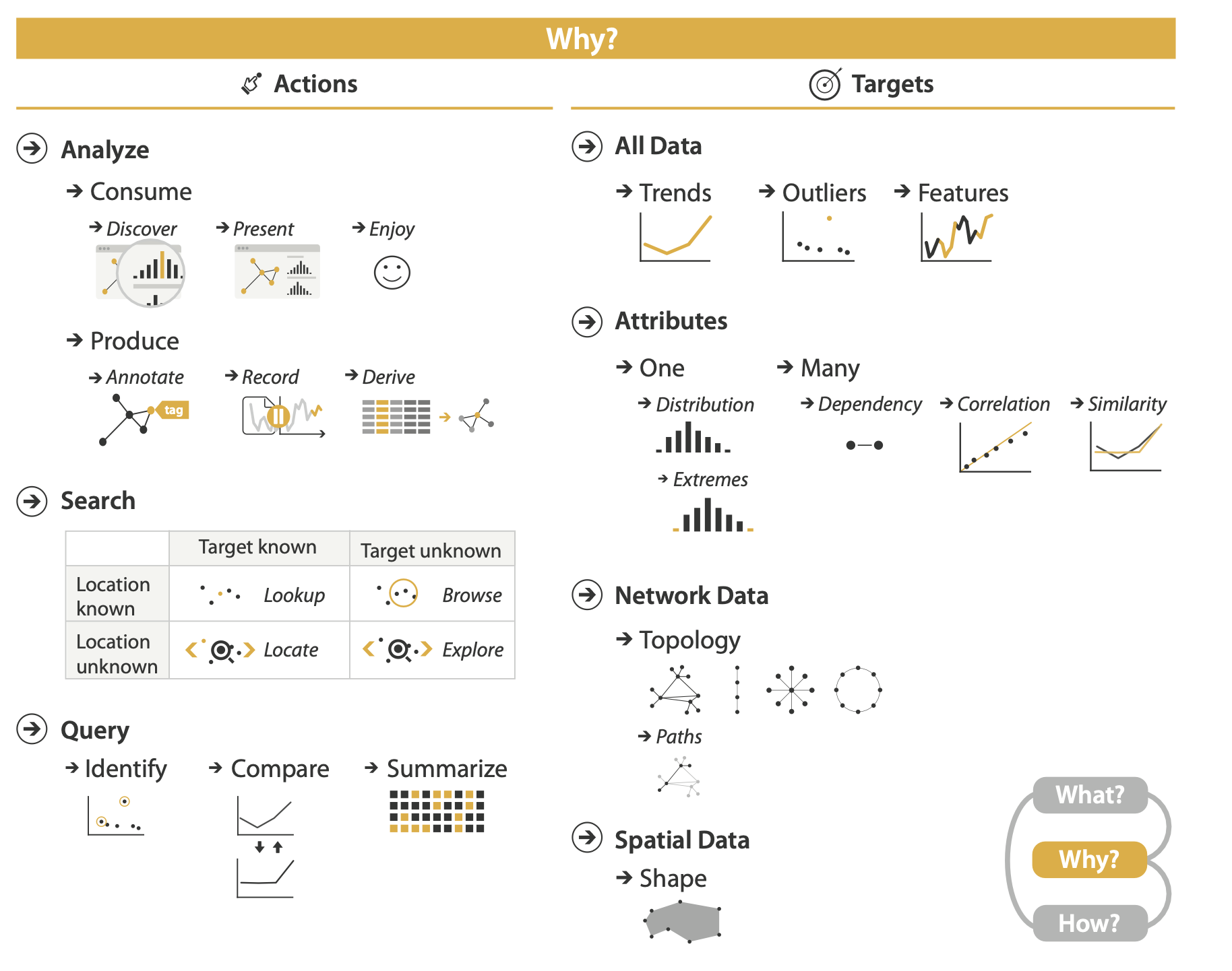
Analyze
At the highest level, the framework distinguishes between two possible goals of people who want to analyze data using a vis tool: users might want only to consume existing information or also to actively produce new information.
The most common use case for vis is for the user to consume information that has already been generated as data stored in a format amenable to computation.
Discover
The discover goal refers to using vis to find new knowledge that was not previously known. Discovery may arise from the serendipitous observation of unexpected phenomena, but the investigation may be motivated by existing theories, models, hypotheses, or hunches; the outcome is to generate a new hypothesis, and to verify—or disconfirm—an existing hypothesis.
The fundamental motivation of this analysis framework is to help you separate out the questions of why the vis is being used from how the vis idiom is designed to achieve those goals
Present
The present goal refers to the use of vis for the succinct communication of information, for telling a story with data, or for guiding an audience through a series of cognitive operations.
The crucial point about the present goal is that vis is being used by somebody to communicate something specific and already understood to an audience.
Enjoy
The enjoy goal refers to casual encounters with vis.
One aspect of this classification that’s tricky is that the goals of the eventual vis user might not be a match with the user goals conjectured by the vis designer.
Produce
in the produce case, the intent of the user is to generate new material. Often the goal with produce is to produce output that is used im- mediately, as input to the next instance.
Annotate
The annotate goal refers to the addition of graphical or textual annotations associated with one or more preexisting visualization elements, typically as a manual action by the user.
When an annotation is associated with data items, the annotation could be thought of as a new attribute for them.
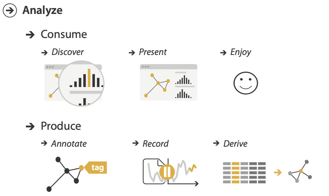
Record
The record goal saves or captures visualization elements as persistent artifacts.
Recording and retaining artifacts such as these are often desirable for maintaining a sense of analytical provenance, allowing users to revisit earlier states or parameter settings.
Derive
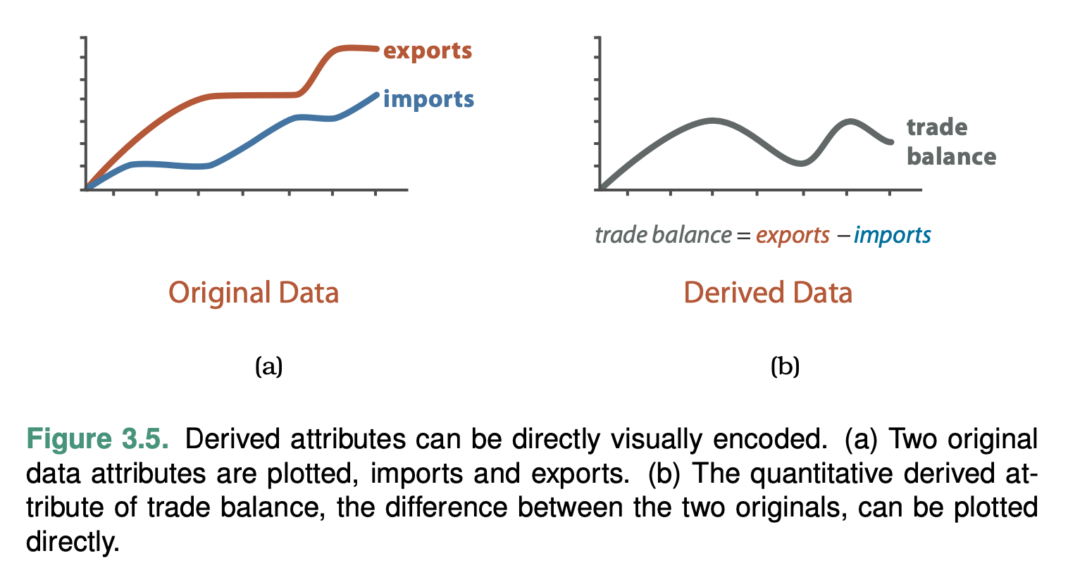
The derive goal is to produce new data elements based on existing data elements.
New attributes can be derived from information contained within existing ones, or data can be transformed from one type into another.
The common case is that deriving new data is a choice made by vis designers, but this choice could also be driven by a user of a vis tool.
Changing the dataset to another form by deriving new attributes and types greatly expands the design space of possible vis idioms that you can use to display it.
Datasets can be transformed into new ones of a different type, just as new attributes can be derived from existing ones.
Search
All of the high-level analyze cases require the user to search for elements of interest within the vis as a mid-level goal.
Lookup
If users already know both what they’re looking for and where it is, then the search type is simply lookup.
Browse
When users don’t know exactly what they’re looking for, but they do have a location in mind of where to look for it, the search type is browse.
Explore
When users are not even sure of the location, the search type is explore.
Query
Once a target or set of targets for a search has been found, a low- level user goal is to query these targets at one of three scopes: identify, compare, or summarize.
The progression of these three corresponds to an increase in the amount of search targets under consideration: one, some, or all.
Identify
The scope of identify is a single target.
If a search returns known targets, either by lookup or locate, then identify returns their characteristics.
Compare
The scope of compare is multiple targets.
Summarize
The scope of summarize task is all possible targets. A synonym for summarize is overview.
Targets
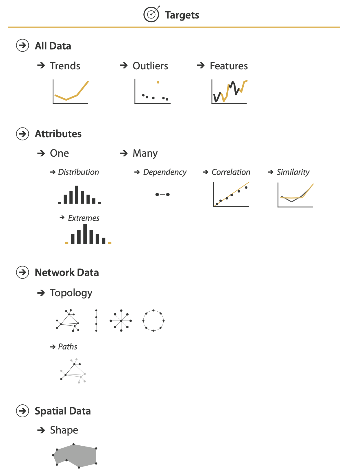
For all kinds of data
A trend is a high-level characterization of a pattern in the data.
Almost inevitably, some data doesn’t fit well with that backdrop; those el- ements are the outliers
The exact definition of features is task dependent, meaning any particular structures of interest.
For attributes
- Find an individual value
- Find the extremes
- Find the distribution of all values for an attribute.
For multiple attributes
A first attribute can have a dependency on a second, where the values for the first directly depend on those of the second.
There is a correlation between one attribute and another if there is a tendency for the values of second to be tied to those of the first.
The similarity between two attributes can be defined as a quantitative measurement calculated on all of their values, allowing attributes to be ranked with respect to how similar, or different, they are from each other.
Network data
The fundamental target with network data is to understand the structure of these interconnections; that is, the network’s topology.
A more specific topological target is a path of one or more links that connects two nodes.
Spatial data
Understanding and comparing the geo- metric shape is the common target of user actions.
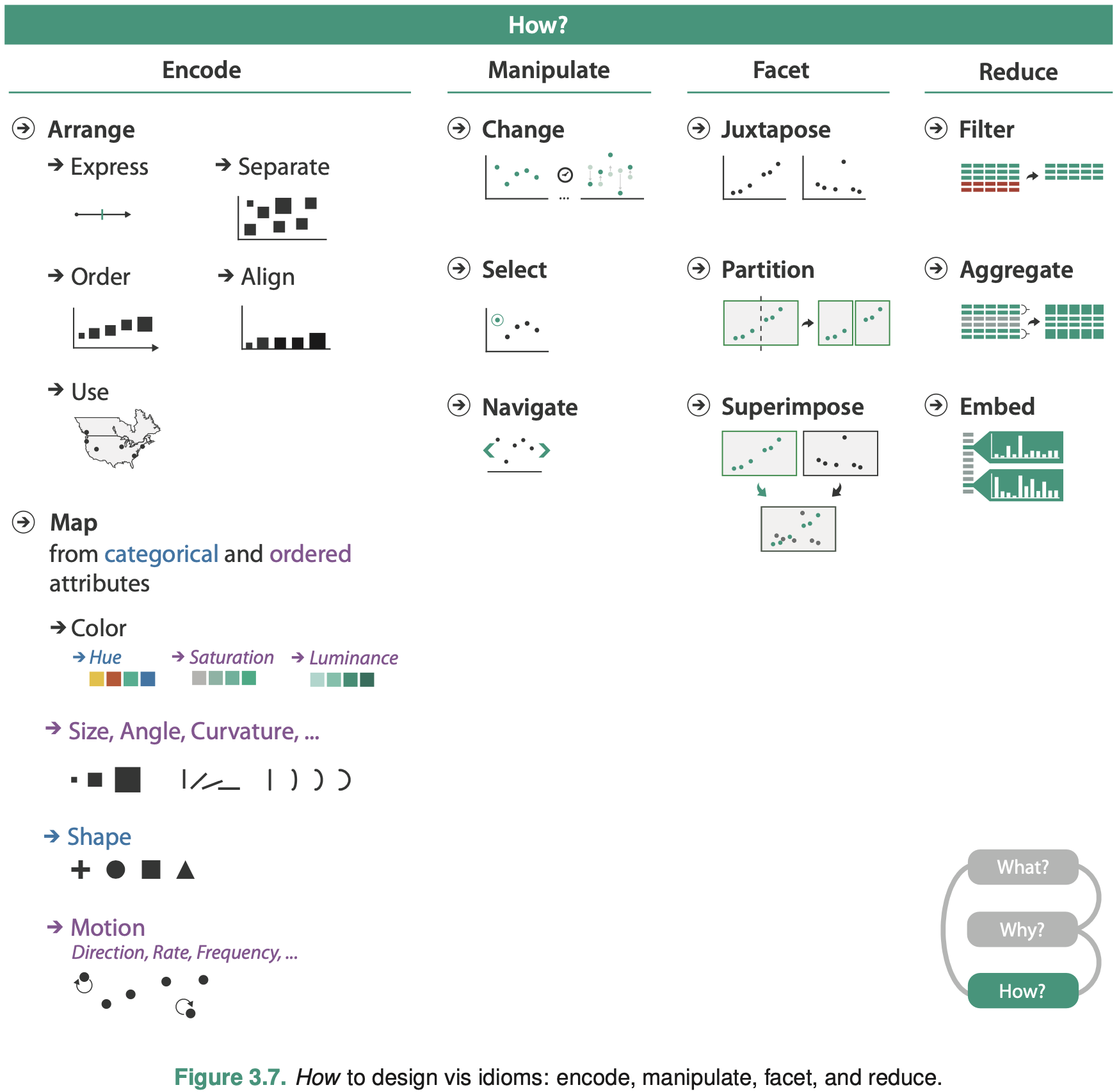
How: A Preview
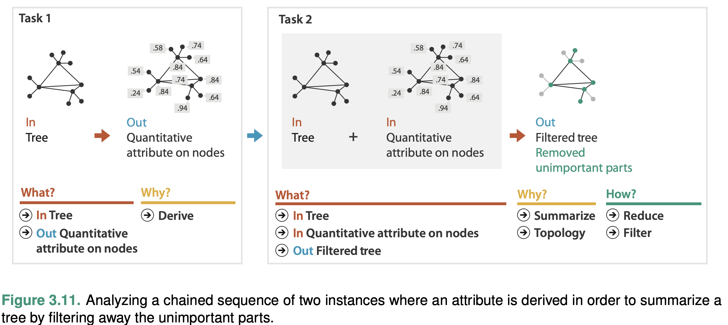
Analyzing and Deriving: Examples
Comparing Two Idioms
Examine two different vis tools that have different answers for the question of how the idiom is designed when used for exactly the same context of why and what at the abstraction level.
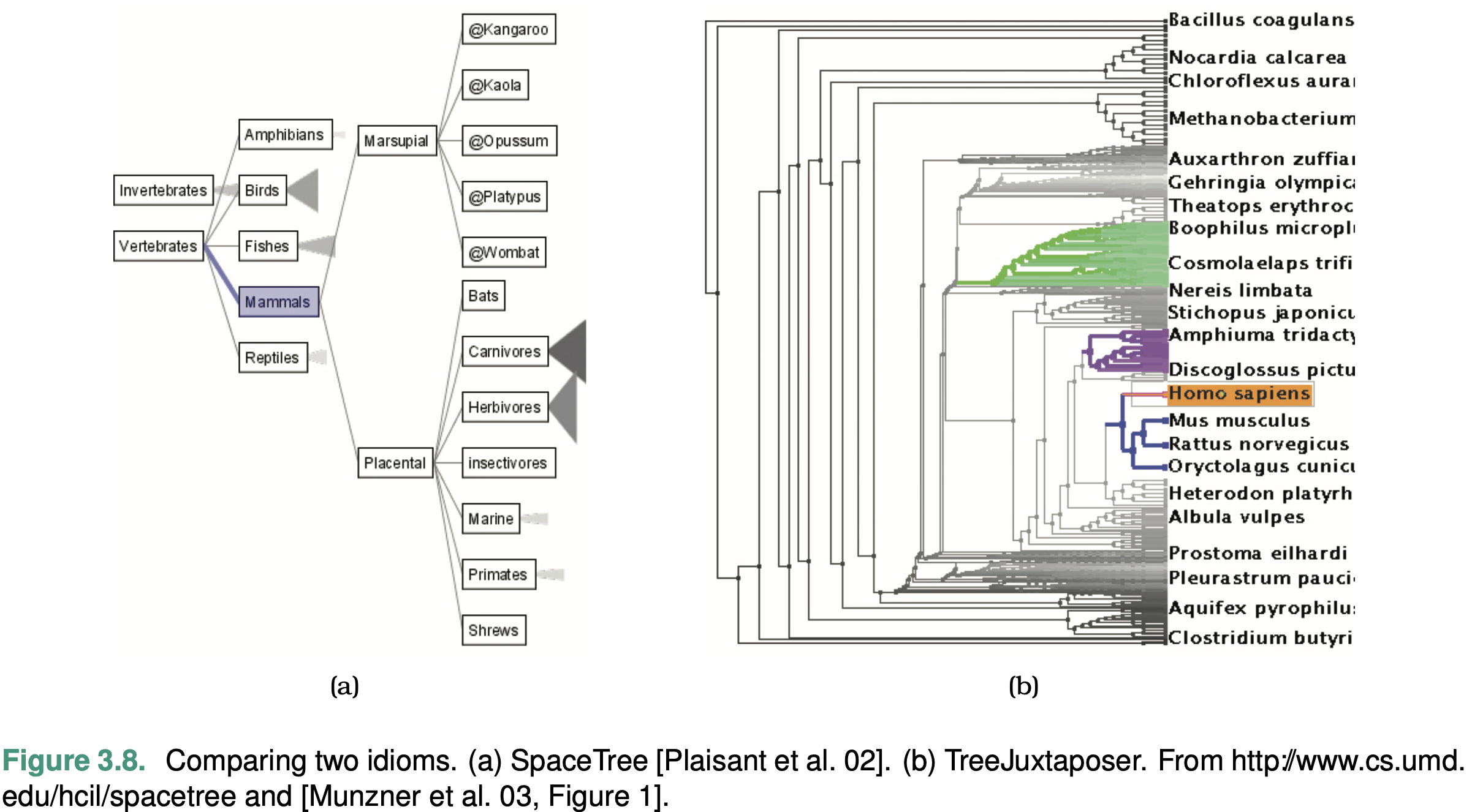
What these tools take as input data is the same: a large tree composed of nodes and links.
Why these tools are being used is for the same goal in this sce- nario: to present a path traced between two nodes of interest to a colleague.
Both tools can be used to locate paths between nodes and identify them.
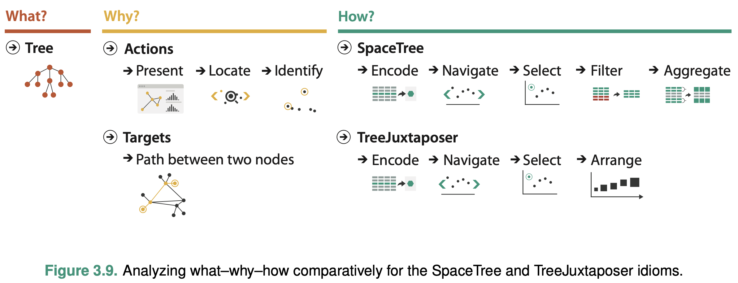
SpaceTree ties the act of selection to a change of what is shown by automatically aggregating and filtering the unselected items.
In contrast, TreeJuxtaposer allows the user to arrange areas of the tree to ensure visibility for areas of interest.
Deriving One Attribute
In a vis showing a complex network or tree, it is useful to be able to filter out most of the complexity by drawing a simpler picture that communicates the key aspects of its topological structure: calculate a new derived attribute that measures the importance of each node in the graph and filter based on that attribute.
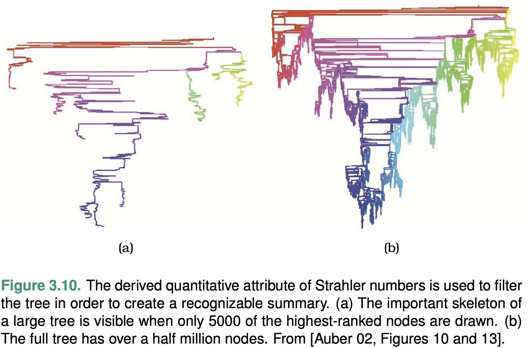
Very central nodes have large Strahler numbers, whereas peripheral nodes have low values.
Deriving Many New Attributes
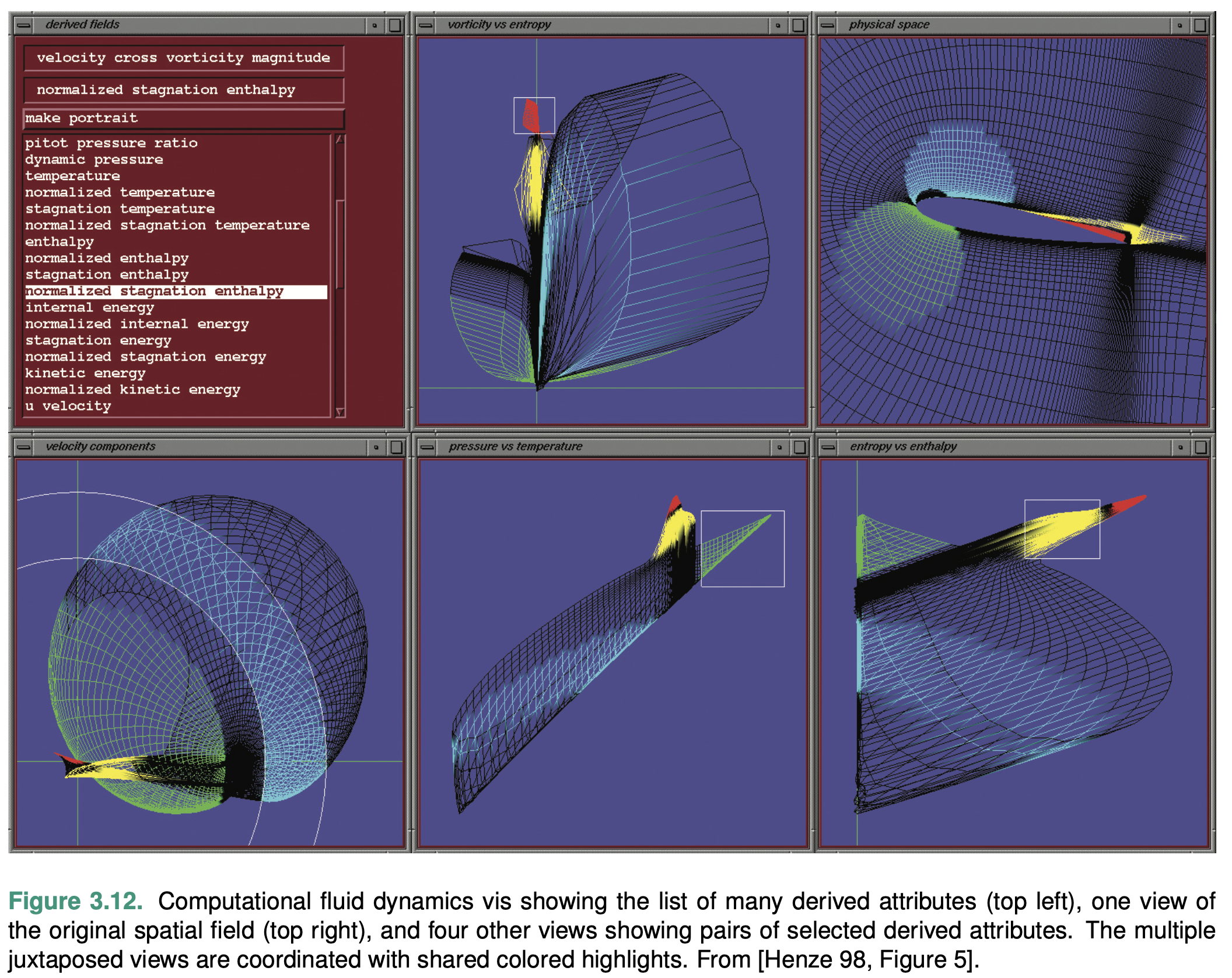
The power of this idiom lies in seeing where regions that are contiguous in one view fall in the other views.
Week 3 Reading Post
Read Munzner 2014 Chapter 5 and 10. Answer below questions with 2-3 sentences, and reply to at least one other person's post.
From: https://images.squarespace-cdn.com/content/v1/55b6a6dce4b089e11621d3ed/1528204277811-JX4HT3U2578DXA5CIW7O/Treemap-with-measure-name-labels.png?format=1000w
Q1. Find one visualization with multiple channels, describe its channels and marks, and then discuss the channel effectiveness (e.g., accuracy, discriminability, separability, pop-out, grouping).
This treemap has channels of size and color and marks of areas. For its channel effectiveness, it uses area size to indicate the sales amount. As Figure 5.7 from the textbook suggests, we humans have relatively low accuracy of perception area channel. As in the treemap, it is easy to tell the sales amount of paper is lower than that of office machines based on the area while it is hard for us to tell the difference between the sales amount of office machines and tables based on area channel. For the color channel, it uses color saturation and color hue to indicate the profit of a product with purer green indicating higher positive profit and purer red indicating higher negative profit. It is very discriminable for us to tell whether a product has positive or negative profits based on the color hue channel. However, for the two products has similar profits, the color saturation channel is not discriminable, for instance, office machines and chairs & chairmats.

Q2. For the same visualization, analyze its color selection (e.g., luminance, saturation, hues, transparency), its color map (how colors are used to encode categories and groups), and other channels if applicable (e.g., how size, angle, motion, texture, etc. are used to encode categories and groups).
The treemap uses color saturation and color hue to indicate the profit of a product with purer green indicating higher positive profit and purer red indicating higher negative profit. While the red and green color hues can help the user distinguishes the profit and loss, the color saturation does a bad job in encoding profit amount, which is quantitative data. For the color map, it uses red and green to encode profit and loss data, which is categorical, and color saturation to encode the profit amount, which is quantitative data. For other channels, it uses the size of the area to encode the amount of sales.
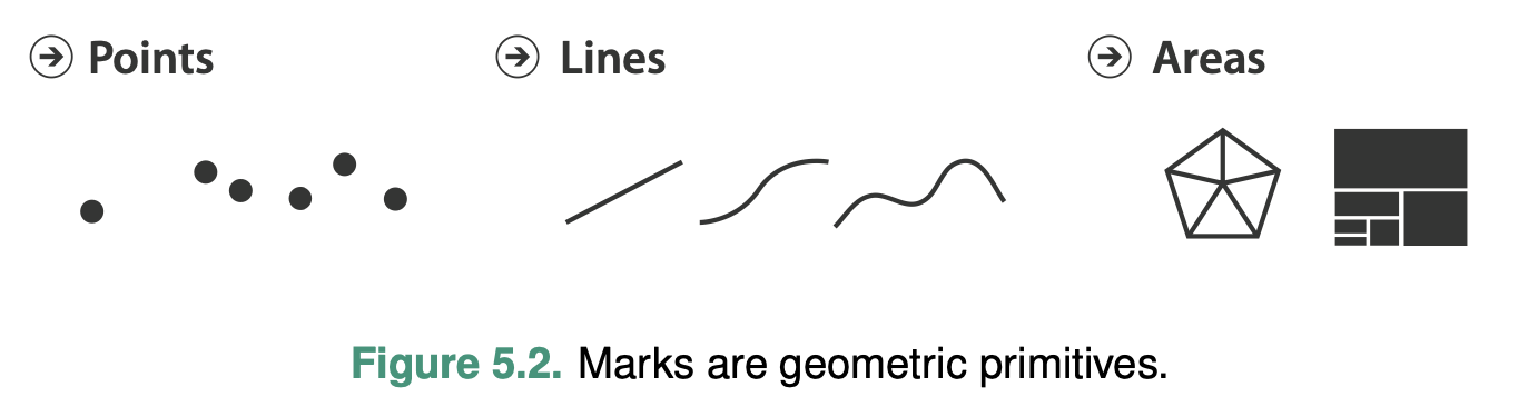
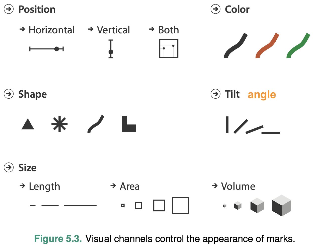
Marks and Channels
Marks are basic geometric elements that depict items or links, and channels control their appearance.
Why Marks and Channels?
The core of the design space of visual encodings can be described as an orthogonal combination of two aspects: graphical elements called marks, and visual channels to control their appearance.
Defining Marks and Channels
Mark
A mark is a basic graphical element in an image.
A zero- dimensional (0D) mark is a point
A one-dimensional (1D) mark is a line
A two-dimensional (2D) mark is an area
A three- dimensional (3D) volume mark is possible
Channel
A visual channel is a way to control the appearance of marks, independent of the dimensionality of the geometric primitive
Using marks and channels
Figure 5.4 shows a progression of chart types, with each show- ing one more quantitative data attribute by using one more visual channel.
The size and shape channels cannot be used on all types of marks: the higher-dimensional mark types usually have built-in constraints that arise from the way that they are defined.
An area mark has both dimensions of its size constrained intrinsi- cally as part of its shape, so area marks typically are not size coded or shape coded.
A line mark that encodes a quantitative attribute using length in one direction can be size coded in the other dimension by changing the width of the line to make it fatter.
Point marks can indeed be size coded and shape coded because their area is completely unconstrained.
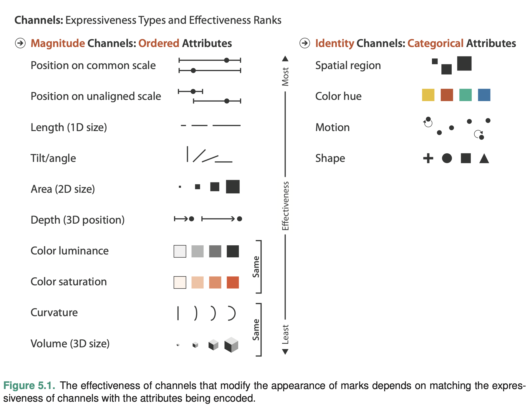
Channel Types
The identity channels tell us infor- mation about what something is or where it is.
The magnitude channels tell us how much of something there is.
Mark Types
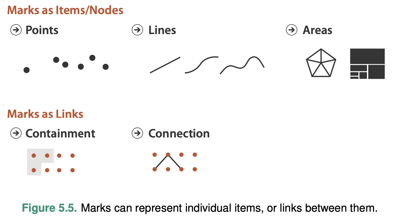
For table datasets, where a mark always represents an item.
For network datasets, a mark might represent either an item—also known as a node—or a link.
Link marks represent a relationship between items.A connection mark shows a pairwise relationship between two items, using a line. A containment mark shows hierarchical relationships using areas, and to do so connection marks can be nested within each other at multiple levels. While the visual representation of the area mark might be with a line that depicts its boundary, containment is fun- damentally about the use of area.
Using Marks and Channels
All channels are not equal: the same data attribute encoded with two different visual channels will result in different information content in our heads after it has passed through the perceptual and cognitive processing pathways of the human visual system.
The use of marks and channels in vis idiom design should be guided by the principles of expressiveness and effectiveness.
Expressiveness and Effectiveness
Expressiveness
The expressiveness principle dictates that the visual encoding should express all of, and only, the information in the dataset attributes.
The most fundamental expression of this principle is that ordered data should be shown in a way that our perceptual system intrinsically senses as ordered. Conversely, unordered data should not be shown in a way that perceptually implies an ordering that does not exist.
The identity channels are the correct match for the categorical attributes that have no intrinsic order. The magnitude channels are the correct match for the ordered at- tributes, both ordinal and quantitative.
Effectiveness
The effectiveness principle dictates that the importance of the attribute should match the salience of the channel; that is, its noticeability.
Channel Rankings
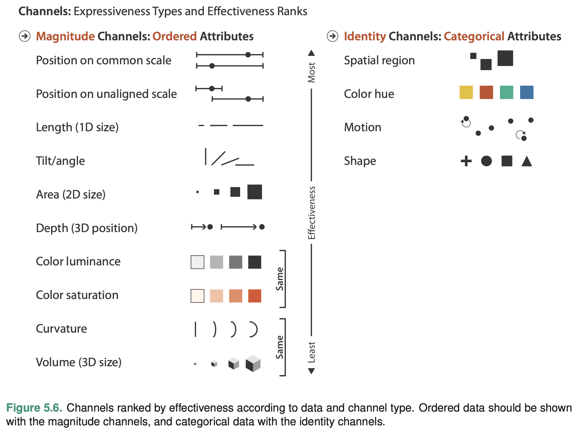
The attributes encoded with position will dominate the user’s mental model—their internal mental representation used for thinking and reasoning—compared with those encoded with any other visual channel.
Channel Effectiveness
To analyze the space of visual encoding possibilities you need to understand the characteristics of these visual channels.
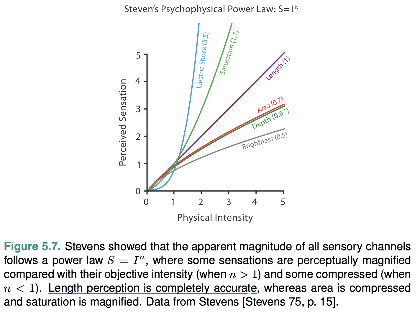
Accuracy
Accuracy: how close is human perceptual judgement to some objective measurement of the stimulus?
Our responses to the sensory experience of magnitude are characterizable by power laws, where the exponent depends on the exact sensory modality: most stimuli are magnified or com- pressed, with few remaining unchanged.
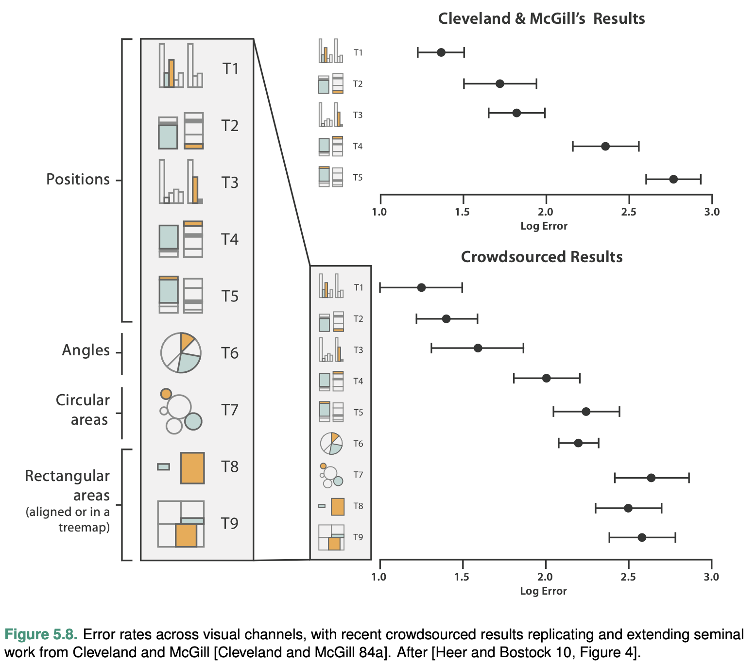
Discriminability
The question of discriminability is: if you encode data using a particular visual channel, are the differences between items perceptible to the human as intended?
The characterization of visual chan- nel thus should quantify the number of bins that are available for use within a visual channel, where each bin is a distinguishable step or level from the other.
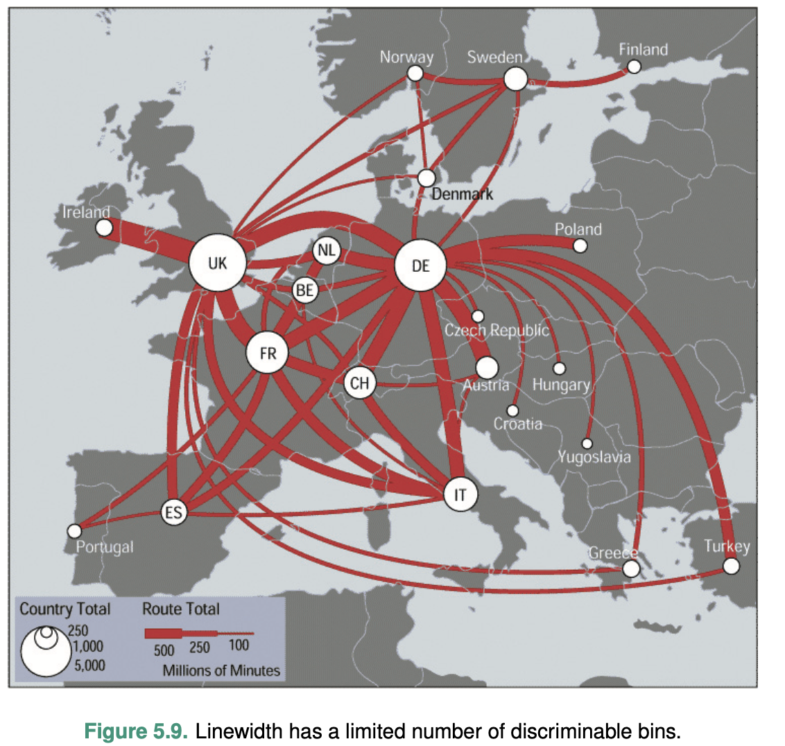
Consider line width: changing the line size only works for a fairly small number of steps. Increasing the width past that limit will result in a mark that is perceived as a polygon area rather than a line mark.
The key factor is matching the ranges: the number of different values that need to be shown for the attribute being encoded must not be greater than the number of bins available for the visual channel used to encode it.
Separability
You must consider a continuum of potential interac- tions between channels for each pair, ranging from the orthogonal and independent separable channels to the inextricably combined integral channels.
Integrality and separability are two endpoints of a con- tinuum, not strictly binary categories
Popout
Many visual channels provide visual popout, where a distinct item stands out from many others immediately.
The great value of popout is that the time it takes us to spot the different object does not depend on the number of distractor objects.
Popout is not an all-or-nothing phenomenon. It depends on both the channel itself and how different the target item is from its surroundings.
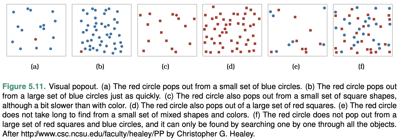
 Popout is definitely not possible with
three or more chan- nels. As a general rule, vis designers should only
count on using popout for a single channel at a time.
Popout is definitely not possible with
three or more chan- nels. As a general rule, vis designers should only
count on using popout for a single channel at a time.
Grouping
Containment is the strongest cue for grouping, with connection coming in second.
The third strongest grouping approach is proximity; that is, placing items within the same spatial region.
The final grouping channel is similarity with the other categorical channels of hue and motion, and also shape if chosen carefully.
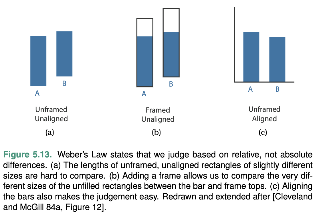
Relative versus Absolute Judgements
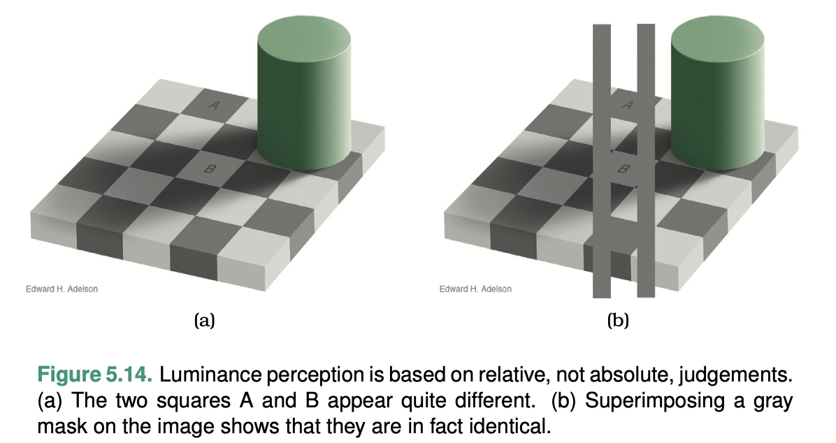
The human perceptual system is fundamentally based on relative judgements, not absolute ones; this principle is known as Weber’s Law. This principle holds true for all sensory modalities.
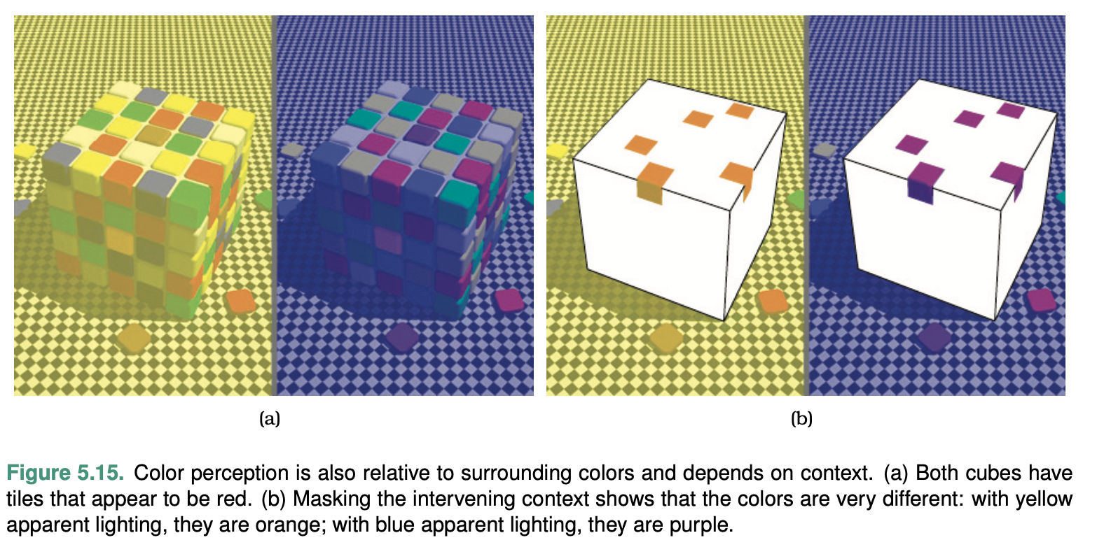
Another example shows that our perception of color and lumi- nance is completely contextual, based on the contrast with sur- rounding colors.
Map Color and Other Channels
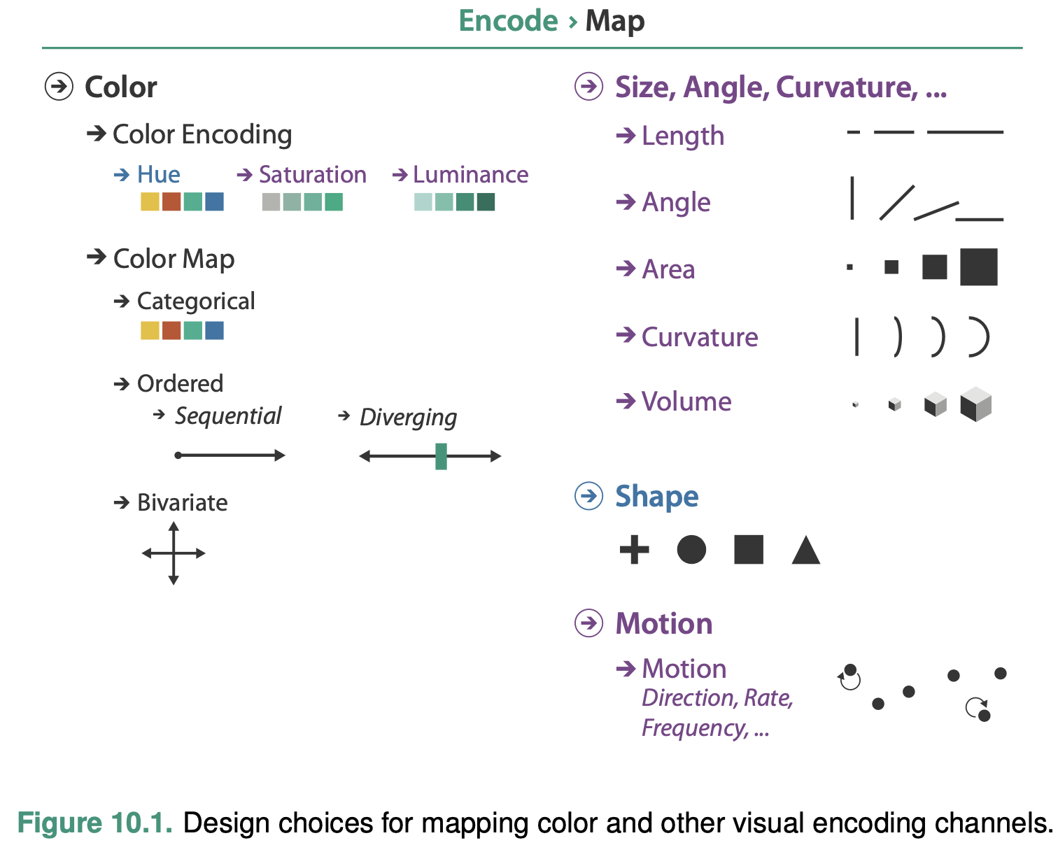
The colloquial term color is best understood in terms of three separate channels: luminance, hue, and saturation.
The major design choice for colormap construction is whether the intent is to distinguish between categorical attributes or to encode ordered attributes.
Color Theory
Color Vision
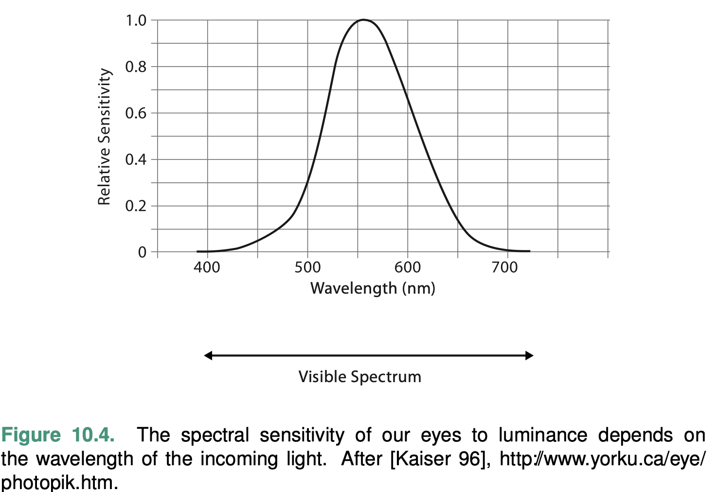
The rods actively contribute to vision only in low-light settings and provide low-resolution black-and-white information. The main sensors in normal lighting conditions are the cones. The luminance channel conveys high-resolution edge information, while the red–green and blue–yellow channels are lower resolution.
Color Spaces
RGB
The most common color space.
Although this system is computationally convenient, it is a very poor match for the me- chanics of how we see.
HSL
HSL system, is more intuitive and is heavily used by artists and designers.
The hue axis captures what we normally think of as pure colors that are not mixed with white or black: red, blue, green, yellow, purple, and so on.
The saturation axis is the amount of white mixed with that pure color. (pink is a partially desaturated red.)
The lightness axis is the amount of black mixed with a color.
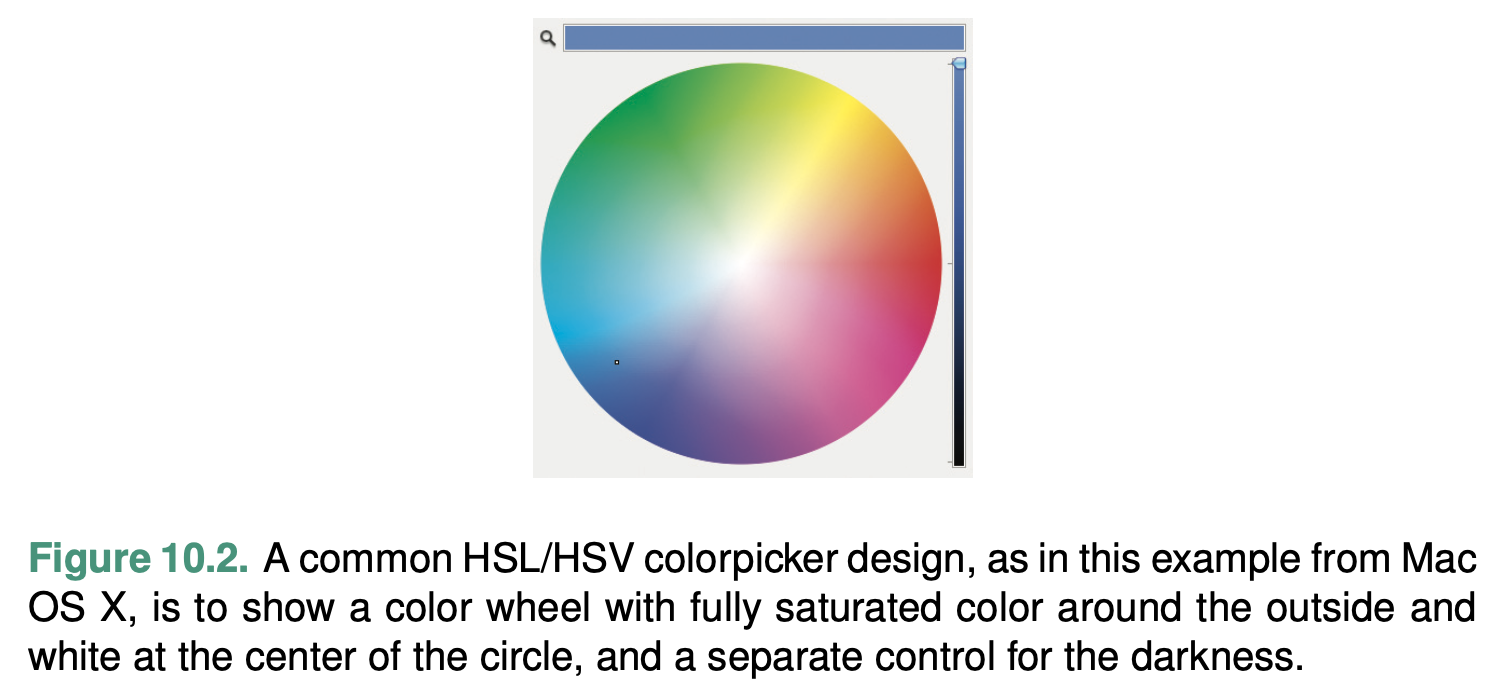
The HSV space is very similar, where V stands for grayscale value and is linearly related to L.
it is only pseudoperceptual: it does not truly reflect how we perceive color.
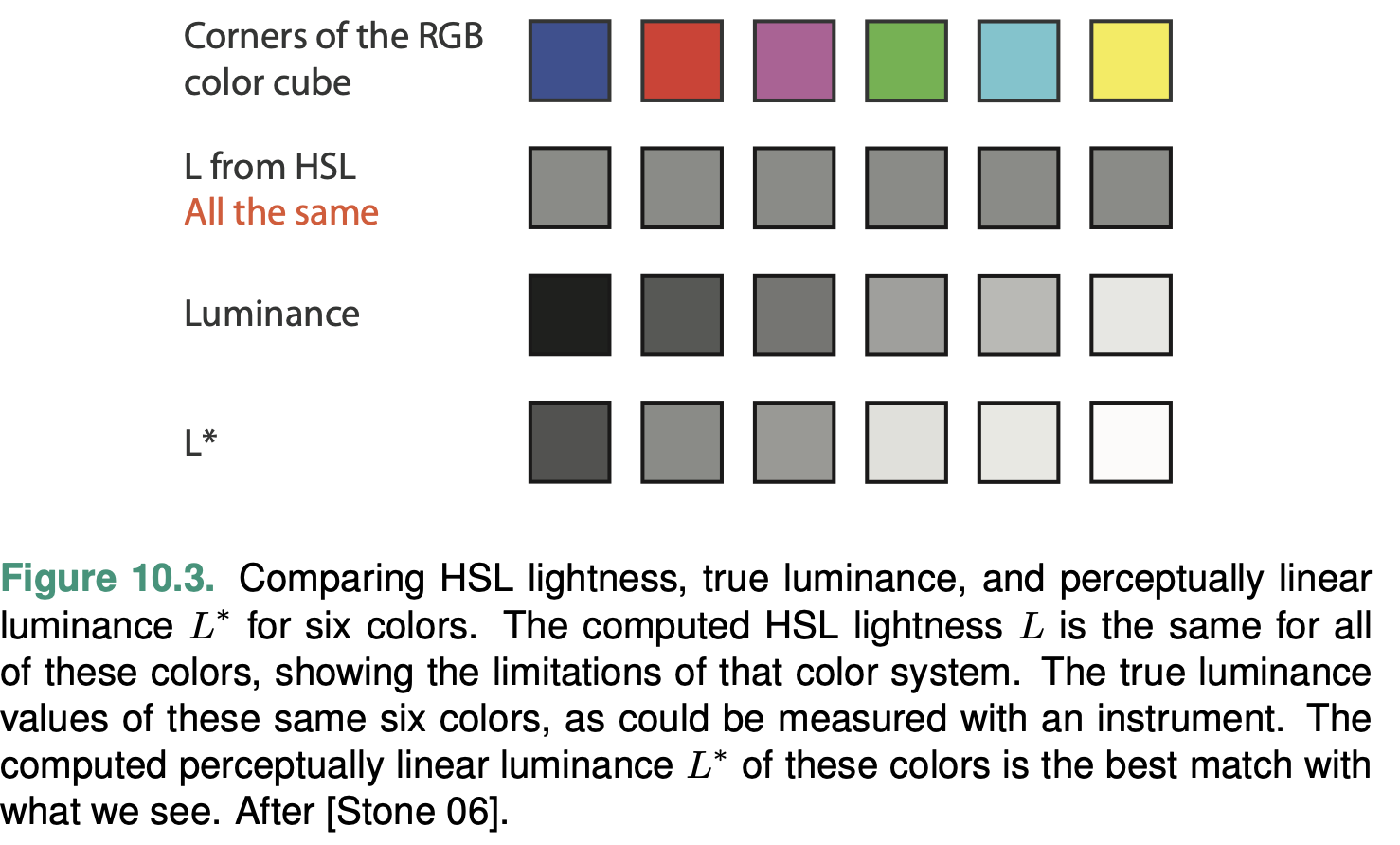
L∗a∗b∗
This space has a single black and white luminance channel L∗, and the two color axes a∗ and b∗.
The L∗ axis is a nonlinear transformation of the luminance perceived by the human eye.
The L∗ axis is de- signed to be perceptually linear, so that equally sized steps appear equal to our visual systems, based on extensive measurement and calibration over a very large set of observers.
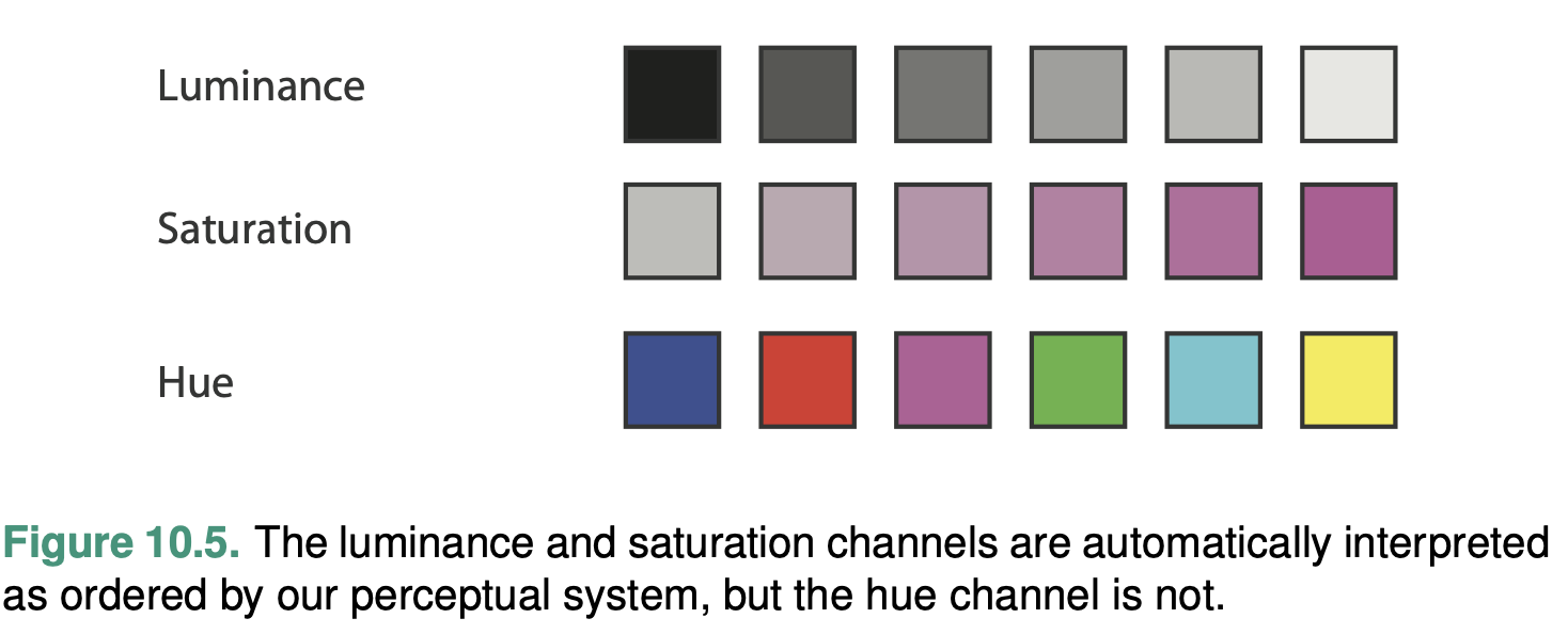
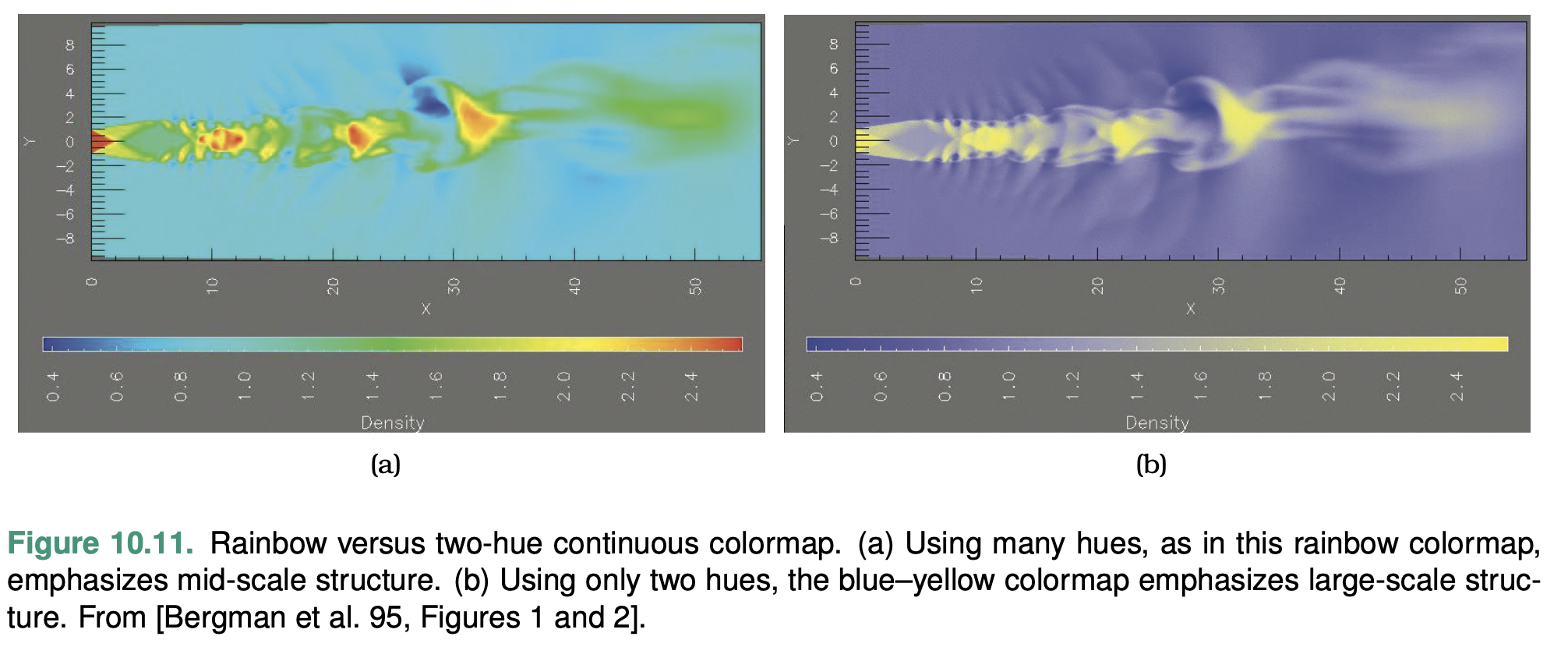
Luminance, Saturation, and Hue
Luminance and saturation are magnitude channels, while hue is a identity channel.
The magnitude channel of luminance is suitable for ordered data types.
Ware suggests avoiding grayscale if more than two to four bins are required
A crucial consideration when visual encoding with color is that luminance contrast is the only way we can resolve fine detail and see crisp edges; hue contrast or saturation contrast does not provide detectable edges.
The magnitude channel of saturation is also suitable for ordered data.
Saturation shares the problem of low accuracy for noncon- tiguous regions. The number of discriminable steps for saturation is low: around three bins
Moreover, saturation interacts strongly with the size channel: it is more difficult to perceive in small regions than in large ones. Saturation and hue are not separable channels within small re- gions for the purpose of categorical color coding.
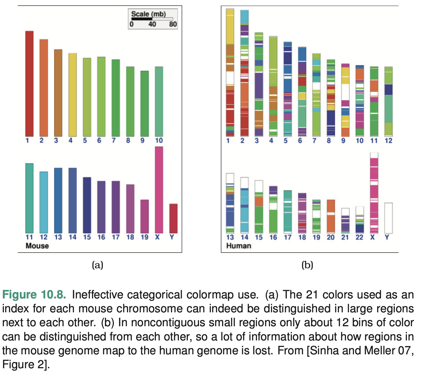
The identity channel of hue is extremely effective for categorical data and showing groupings.
However, hue shares the same challenges as saturation in terms of interaction with the size channel: hue is harder to distinguish in small regions than large regions. Hue does not have an im- plicit perceptual ordering
Transparency
Transparency: information can be encoded by decreasing the opacity of a mark from fully opaque to completely see-through. Transparency cannot be used independently of the other color channels because of its strong interaction effects with them: fully transparent marks cannot convey any information at all with the other three channels. In particular, transparency coding interacts strongly with luminance and saturation coding and should not be used in conjunction with them at all. It can be used in conjunc- tion with hue encoding with a very small number of discriminable steps, most frequently just two
Colormaps
A colormap specifies a mapping between colors and data values; that is, a visual encoding with color.
Colormaps can be categorical or ordered, and ordered colormaps can be either se- quential or diverging.
Colormaps can either be a continuous range of values, or seg- mented into discrete bins of color.
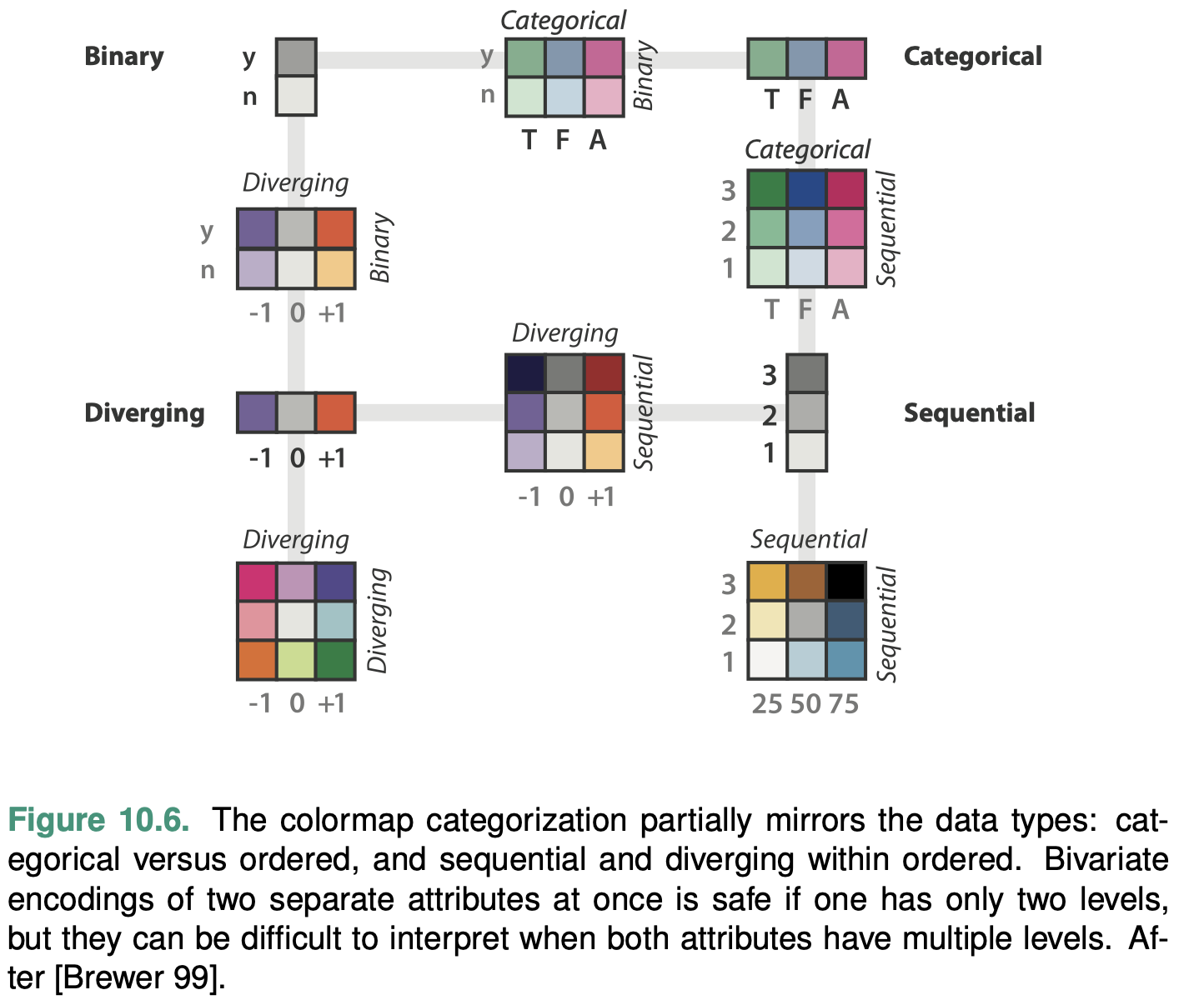
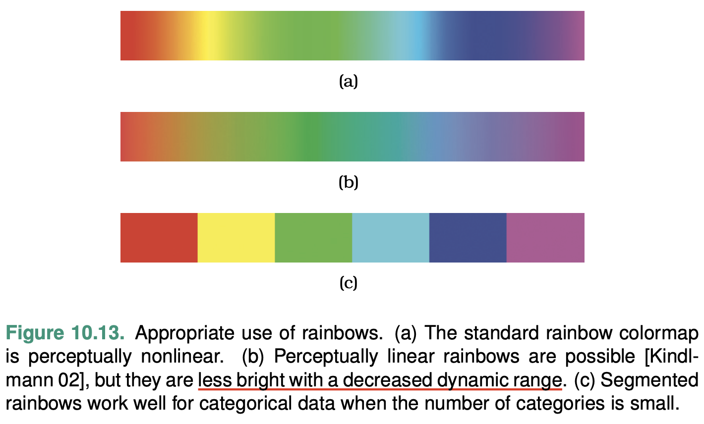
Categorical Colormaps
A categorical colormap uses color to encode categories and groupings. Categorical colormaps are normally segmented
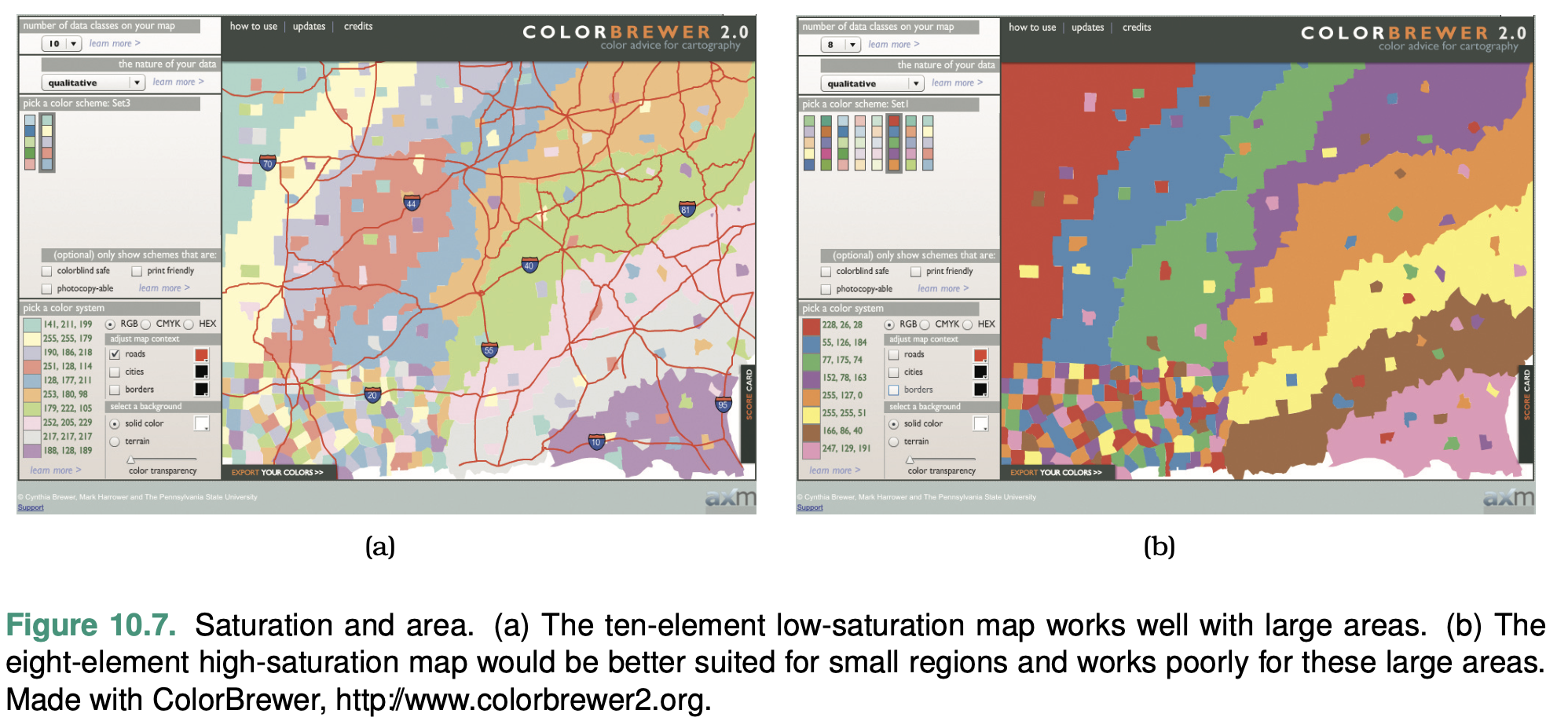
The number of discriminable colors for coding small separated regions is limited to between six and twelve bins. You should re- member to include background color and any default object colors in your total count: some or all of the most basic choices of black, white, and gray are often devoted to those uses.
Ordered Colormaps
An ordered colormap is appropriate for encoding ordinal or quantitative attributes.
A sequential colormap ranges from a minimum value to a maximum value.
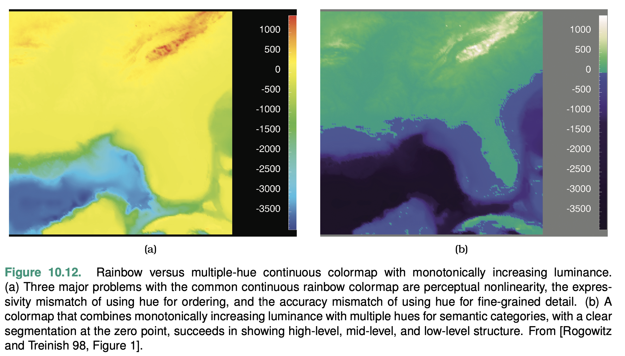
A diverging colormap has two hues at the endpoints and a neutral color as a midpoint, such as white, gray, or black, or a high-luminance color such as yellow.
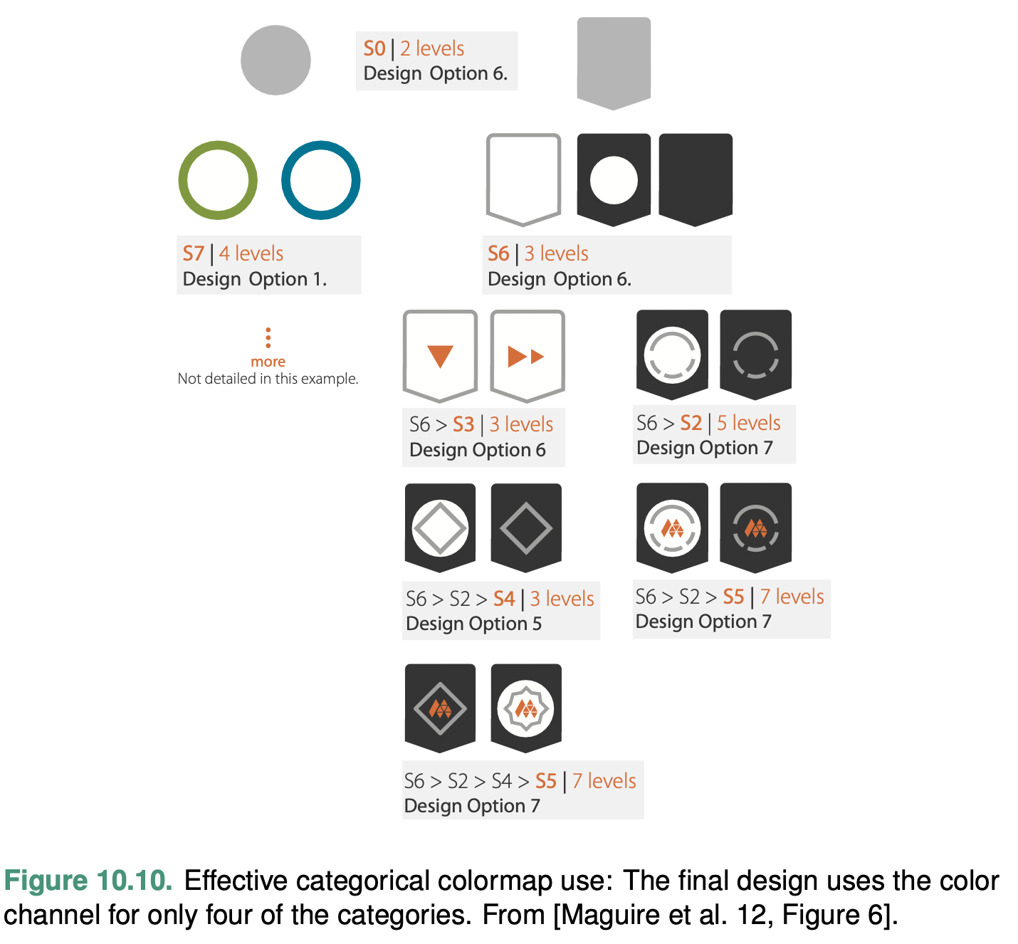
Design monotoni- cally increasing luminance colormaps: that is, where the multiple hues are ordered according to their luminance from lowest to highest.
Bivariate Colormaps
The safest use of the color channel is to visually encode a single attribute; these colormaps are known as univariate.
Other Channels
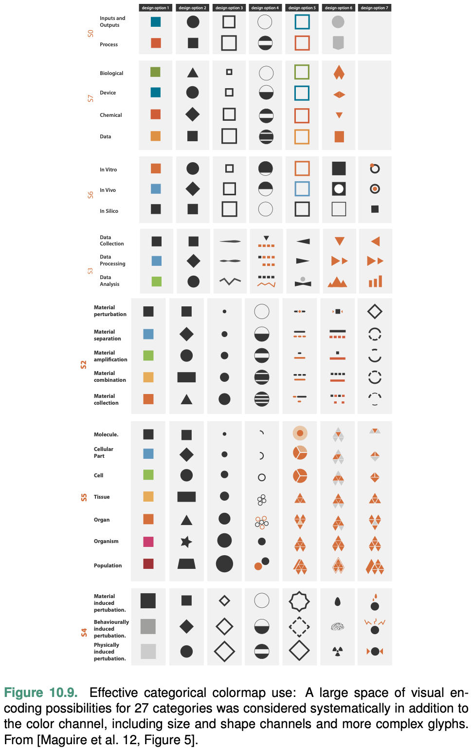
Size Channels
Size is a magnitude channel suitable for ordered data. It interacts with most other channels: when marks are too small, encodings in another channel such as shape or orientation simply cannot be seen. Size interacts particularly strongly with color hue and color saturation.
Length is one-dimensional (1D) size; more specifically, height is vertical size and width is horizontal size. Area is two-dimensional (2D) size, and volume is three-dimensional (3D) size.
Our judgements of length are extremely accurate.
Angle Channel
The angle channel encodes magnitude information based on the orientation of a mark: the direction that it points.
With angle, the orientation of one line is judged with respect to another line.
With tilt, an orientation is judged against the global frame of the display.
The accuracy of our perception of angle is not uniform. We have very accurate perceptions of angles near the exact horizontal, vertical, or diagonal positions, but accuracy drops off in between them.
Curvature Channel
The curvature channel is not very accurate, and it can only be used with line marks.
It cannot be used with point marks that have no length, or area marks because their shape is fully constrained.
Shape Channel
The term shape is a catch-all word for a complex perceptual phenomenon.
Motion Channels
Several kinds of motion are also visual channels, including direc- tion of motion, velocity of motion, and flicker frequency.
The strength and weakness of motion is that it strongly draws attention; it is nearly impossible to ignore.
It is not clear whether different motion channels are separable from each other, or how many discriminable bins exist in each.
The motion channels are most appropriate for highlighting, where drawing the user’s attention away from the rest of the scene is exactly the goal, particularly when the highlighting is transitory rather than ongoing.
Texture and Stippling
The term texture refers to very small-scale patterns.
Texture can be used to show categorical attributes, in which case the goal is to create patterns that are distinguishable from each other using the combination of all three channels.
The term stippling means to fill in regions of drawing with short strokes. It is a special case of texture.
Week 4 Reading Post
Read Munzner 2014 Chapter 4 and 9, and answer below questions in 2-3 sentences. Reply to at least one other person's post.
Q1. Find one network visualization (trees or networks) and describe (1) it's design idiom and (2) the what-why-how (data-encode-tasks) elements of it.
From: https://www.yworks.com/assets/images/landing-pages/demo-networkmonitoring-example.ae6cd134ce.webp
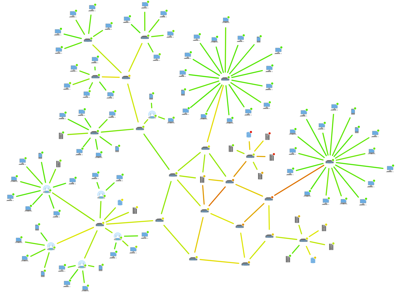 This
visualization uses a network graph, which is a node-link diagram, to
encode a computer network map. Here the data is the status of connecting
devices and network switches. The network devices (PCs, laptops,
tablets, servers, databases, etc.) are encoded as nodes (vertices), and
the connection between those devices are encoded as edges (links) in the
network graph. The edges are colored green, yellow, and red,
representing light, middle, and heavy network traffic correspondingly.
The network graph presents its users (network administrators) with the
topological relationship of the devices and an overview of their system,
as well as the status of network traffic, assisting them to control and
troubleshoot the network system from a central location.
This
visualization uses a network graph, which is a node-link diagram, to
encode a computer network map. Here the data is the status of connecting
devices and network switches. The network devices (PCs, laptops,
tablets, servers, databases, etc.) are encoded as nodes (vertices), and
the connection between those devices are encoded as edges (links) in the
network graph. The edges are colored green, yellow, and red,
representing light, middle, and heavy network traffic correspondingly.
The network graph presents its users (network administrators) with the
topological relationship of the devices and an overview of their system,
as well as the status of network traffic, assisting them to control and
troubleshoot the network system from a central location.
Week 5 Reading Post
Read one of below papers and answer the discussion question in 2-3 sentences (Pls find them in the Resources/Readings). Reply to at least one other person's post.
Paper options (pick one to read):
\1. Isenberg et al. Vispubdata.org: A Metadata Collection About IEEE Visualization (VIS) Publications. IEEE TRANSACTIONS ON VISUALIZATION AND COMPUTER GRAPHICS, VOL. 23, NO. 9, SEPTEMBER 2017.
\2. Havre et al. ThemeRiver: Visualizing Theme Changes over Time. Proceedings of the IEEE Symposium on Information Visualization 2000 (InfoVis'00).
Discussion questions:
Q1. What's this paper about? What visualization techniques the authors implemented? What's the contributions of this work?
Q2. Pick one visualization from this paper, and evaluate its data (& attributes), user task, and efficiency.
ThemeRiver
The paper is about a thematic visualization called ThemeRiver. The authors implemented the visualization techniques of the time river, with adjustment. The horizontal flow represents the change in time. The width of the river represents the variation (increase/decrease) of the strength of a topic. The currents are colored to represent different themes. The ThemeRiver fills the hole in the visualization of themes of associated documents and provides users with a macro-view over the themes of documents, as existing visualizations focus mainly on documents themselves.
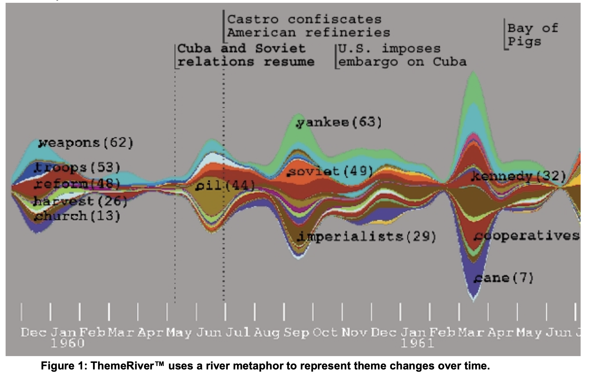
Data: A collection of speeches, interviews, articles, and other text related to Fidel Castro.
Attributes: themes, year
User task:
Explore the change of theme over time
Display topic and event labels
Display time and event grid lines
Display the raw data points
Choose among drawing algorithms for the
currents and river
Efficiency:
Users tend to follow the trend more easily over time
Users find the plot useful in identifying macro trends in particularly.
ThemeRiver requires users to interpolate between data points to produce the curve